


The Parkland College Graphic Design Student Show is an annual juried exhibition that showcases the best in student work from the Graphic Design and Interactive Design Programs at Parkland College. Since 2008, a jury of Parkland faculty has selected the best student work from the academic year in marketing, communication, branding, advertising, and design for display in Parkland’s Giertz Gallery. Local industry professionals are then invited to judge the show and select awards donated by local businesses and supporters of the Interactive Design and Graphic Design programs. Awards include things like Graphic Design Best of Show , Fine & Applied Arts Department Chair Award, and Studio 2D Design Strategy Award.
This year’s judges were Ralph Roether, Graphic Designer for the Champaign Park District, and Maria Ludeke of Neutral Design Studio. The show is an opportunity for students to show off their work and celebrate a good year, while making connections with local design professionals. I visited the Giertz Gallery on Wednesday night May 15th, when a reception was held to announce the award winners. The reception was followed by a short gallery talk by graphic design instructor Liza Wynette.
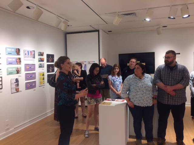
Liza Wynette gives gallery talk
Since going to the 2016 CUDO Pro Show this fall, design has been percolating in the back of my mind. I’ve come to think that design and comics have a lot in common. Both use a combination of images and words — which people call storytelling — to convey a message in broad and efficient strokes. A character’s expression or the composition of a landscape can say so much in the way of tone, character, and plot; things like color and font transmit concepts, values, and imperatives to action with lightning speed. Lately I’ve been reading comic artist Lynda Barry’s What It Is. In this book, she asks the question, “What is an image?” To Barry, images have a life of their own. When you see an image that is *alive,* something concrete — an experience — is communicated to the viewer (see her strip How to Look at Art). I’ll take a page out of her book and ask: when it comes to good design, What Is It?
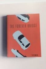 First things first, I don’t know what it is. The one big takeaway from my experience of the Graphic Design Student Show was that the pieces I liked from any given category weren’t always the ones that the judges chose. For instance, I loved a cover for a book called The Forever Bridge, designed by Kinara Morris for client T. Greenwood. The combination of the provocative title (what could “forever bridge” mean?) and the image of a repeating car falling into space made me want to buy the book. However, Emily Gorski’s cover for Carl Sagan’s Pale Blue Dot was the one that secured the Fine & Applied Arts Department Chair Award. When you realize that Pale Blue Dot is about the folly and fragility of human enterprise on earth, the design, which shows a stylized earth crumbling from the bottom, makes a lot of sense (and the little illustration is indeed very cool). On the other hand, I found myself frustrated by the same student’s packaging design for Bigelow tea, which won Typography Best of Show. I just wanted to color it in!
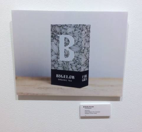
Emily Gorski’s piece for the Bigelow Tea Company in the branding category
 Second things second, it’s speculative. Or at least the Parkland College Graphic Design Student Show is. One of the first things I noticed upon entering the gallery was that many of the pieces were designed for actual Champaign-Urbana businesses, from Champaign-Urbana Adventures in Time and Space to the Champaign County Humane Society. During Liza Wynette’s gallery talk, we learned that the program asks students to design for Champaign-Urbana businesses in order to prepare them for jobs in the community after graduation. It gives “believability” to their portfolios, and in the process many of them make networking contacts that become useful later. As a result, you could easily view the gallery show as a far-future exhibit of ephemera from an alternate Champaign-Urbana, and I challenge you to do this. Imagine, a CU where I can actually figure out what to order from the Jarling’s menu.
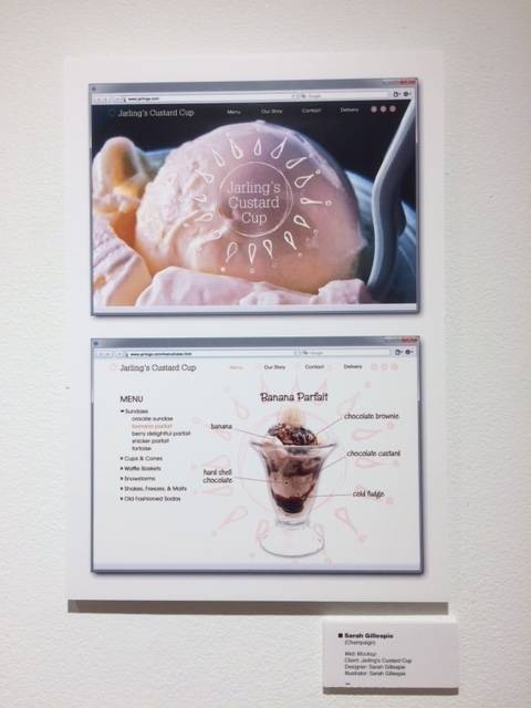
Sarah Gillespie’s Web Mockup for Jarling’s Custard Cup
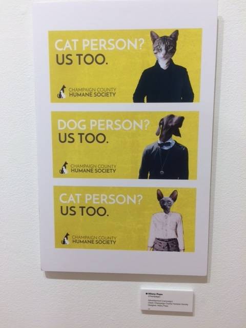
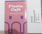
Thirdly, it’s a process. As part of the gallery talk, Wynette described the life of a project, from gathering information and writing a brief, through concept drawings, multiple stages of proofs, critiques, a final version, and revisions. From comments that students in the audience made, I gathered that a lot of blood and sweat had gone into the polished final products on view in the gallery. Jason Dockins, whose Slaughterhouse Five book trailer for the Champaign Public Library won Graphic Design Best of Show, described the trailer as the result of a complete overhaul when his colleagues panned an earlier version in a critique. In addition, although we often think of design as separate from an artist’s personal expression, all of the students had their own signature style. I found Hillary Pope’s awesome collages by poking around her website (“websites” is a category, and there are a couple of computer stations where you can peruse them). Her art influences the bright, pop-punk aesthetic that characterized everything of hers in the show from her Fiesta Cafe menu to the “everybody’s talking” graphic on the show’s promotional materials.
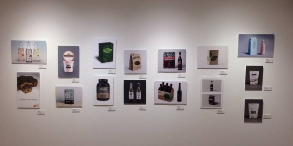
 Fourth of all, it’s complicated. Upon reflection, I realized that some of the pieces I liked the most in a gallery setting or found the most interesting didn’t necessarily coincide with what I would actually buy or which business I would frequent. For instance, I was a big fan of this bizarre milk packaging for Lon Lon milk by Jack Nave. But would I buy this milk? Perhaps not (though maybe that’s because it seems like a luxury milk that I could not afford). I loved
 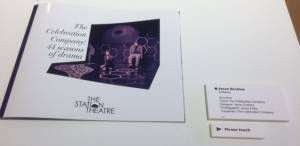 everything Hilary Pope had in the show, but would I go to Fiesta Cafe if the menu were pink and purple? We just don’t know. However, there were a couple instances where I liked the piece and it made me want to buy the thing or go to the place. Like Jason Dockins’ brochure for The Celebration Company, or Justin Klett’s poster for Alamo Drafthouse Cinema.
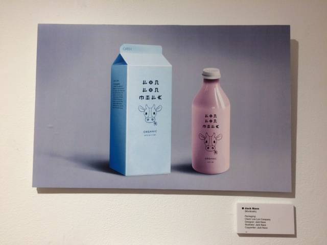
Jack Nave’s packaging for Lon Lon Company
So what is it? Go to the Parkland College Graphic Design Student Show and find out for yourself. The show will run until June 1st, 2017 at the Giertz Gallery, which is located at 2400 W Bradley Ave in Champaign (in the C wing of Parkland). Summer gallery hours are Mon-Thurs, 10 a.m.-7 p.m.