


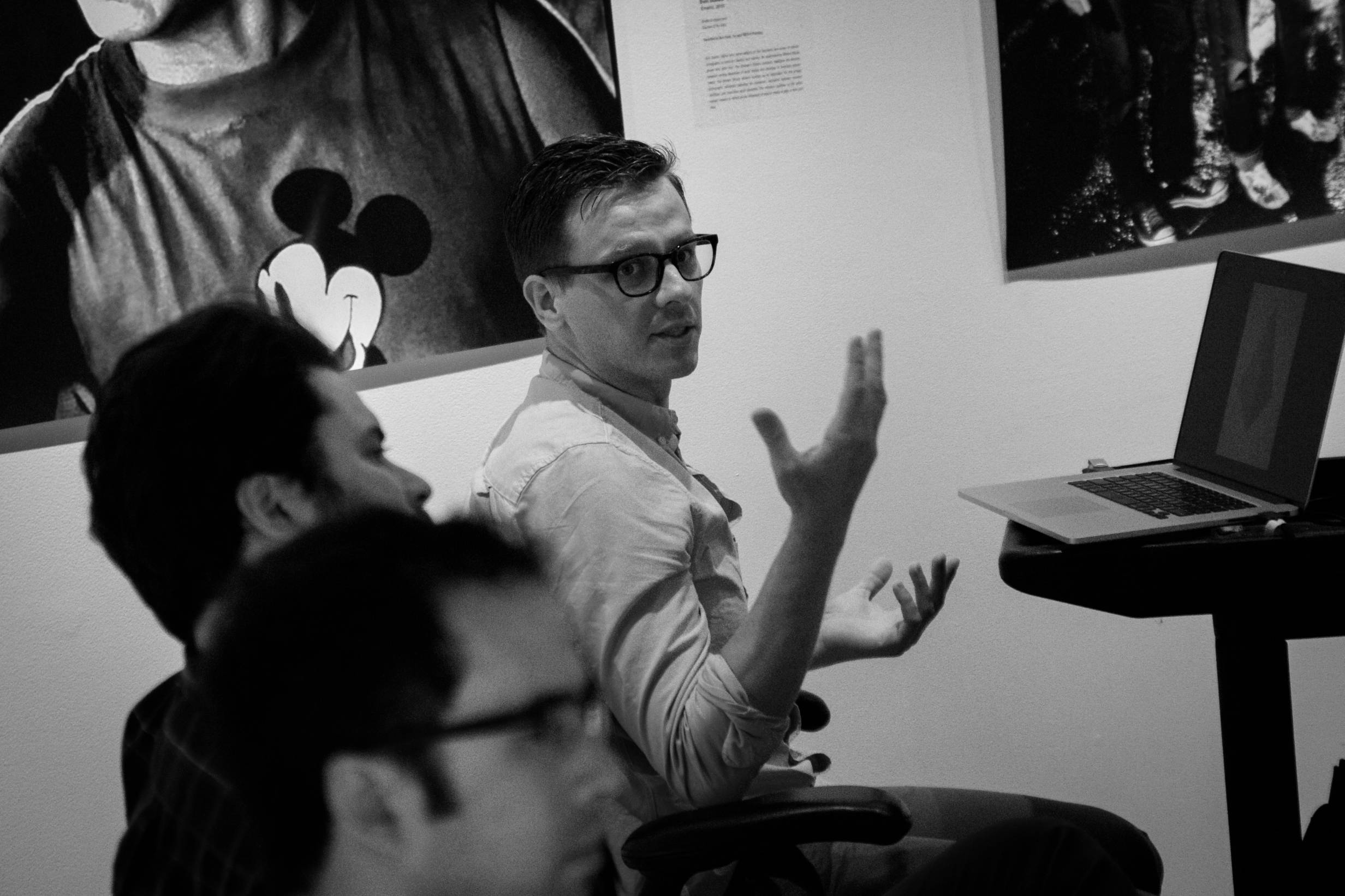
After reading Sam Logan’s piece on the recent exhibition at Figure One, where attendees participated in a group discussion with the artists, I was envious of the chance to “get inside an artist’s head”. While wandering through a few portfolio webpages, the work of Bill Berger literally caught my eye… I found myself gazing at his images meant to trick the eye and confuse the mind for the better part of the evening. I got in touch with him, and we spent an enjoyable hour talking about talking, optical illusions, meditation, and the inevitable yet unexpected betrayal by character wrestlers.
We started with the Figure One experience. Having known my share of artists of all types, I was curious where he fell on the spectrum of speaking about his art, let alone having a group of people just lob any question they had at random. He admitted to reticence regarding his art’s interpretation, and while the most common response I hear to this is that the artist “wants the work to speak for itself,” instead Berger spoke of visual pieces actually becoming language. As words, text, and writing devolves, he feels, visual representation will become its own language. Why describe a chair when we can just post it to Instagram or Tumblr?
But as we spoke, he mentioned that when he fields questions about his work, he prefers to speak to his process rather than meaning. Which suited me just fine, actually, because I admitted to finding his online gallery to be quite the puzzle. I saw pieces titled “RGB” that looked like they were digitally generated, which would actually make them CMYK. There were pieces that looked exactly like framed sheets of crumpled paper. Despite knowing it’s ill-advised to see the man behind the curtain, I honestly was so much more curious about the behind-the-scenes than the deep meaning behind it all. And as we continued to talk, I found out that the backstories of his work truly added to the conversation I was having with his art.
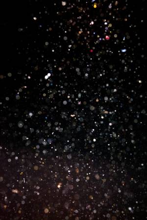 The pieces with the most interesting story were actually the ones that didn’t intrigue me so much upon first glance: the series titled “Dust Compositions”. These black-and-white-noise images turned out to be pieces of clear sticky tape used to pick up dust in certain places (like the Pergamon Museum in Berlin, or construction sites in gentrifying Chicago) and then developed as if they were a film negative. The ones in the similar “Portrait” series collect dust from friends’ houses or even shaken from their clothes (with permission). He got the idea after developing actual film negatives and trying to ensure that they were free and clear of all dust. The concept of dust being a flaw in a photograph seemed so ridiculous, it seemed natural to see what would happen if a photograph was only dust. While I was mesmerized by the potential for patterning within these pieces, somehow knowing the backstory made it even more thought-provoking. Would I know my best friend by his dust? Is making a neighborhood “better” always the “best thing”? These questions and more started going through my head as I looked at images that I had previously glanced over as static.
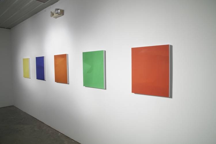
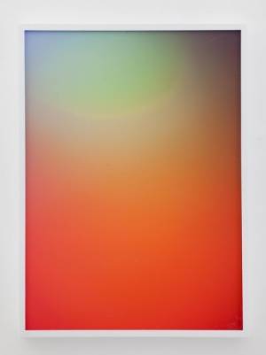 As for the other series that made my mind wonder, two were intentionally created with analog means but made to look as though they were digitally created: “RGB” and “Drop Test” both appear to be beautiful abstractions that could have been easily made by any webdesigner in Photoshop. Much to my dismay, my clever observation that “RGB” looks like it should be called “CMYK” after the colors in an inkjet was met with the explanation that each work was created by setting up three colored flashlights (one red, one green, one blue), projecting them onto a wall, and then photographing the result. In the “Drop Test” series, the bubbles in the images were made with automobile paint, and then sprayed with varnish so they would keep their shapes. Then more varnish was layered on top of each painting so the surface would be smooth and very glossy, like a photograph. Just the opposite, “Objects” is a series of photographs of crinkled art paper. The prints are mounted flat, but the contrasts in the crinkles are emphasized, so most people think the mounted art would feel textured, and spend a lot of time determining that they are looking at a two-dimensional image.
This type of deliberate manipulation, of both the art and the viewer, has become classified as part of the “Zombie Formalism” movement, often applied to any process-based method of painting. Berger begrudgingly claims the label, but admits that he mostly derives a lot of pleasure “messing with people’s minds”, and his artwork validates that stance. A few of his series rely solely on the mind’s reaction to 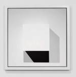 high contrast to create a sense of motion — a common theme in optical illusions. His website used to state that he was interested in producing the “meditative qualities associated with phenomena such as decay, degradation, failure, flaw, and interference.” I can attest to the truth of those statements, honestly clocking several hours just staring at his work and letting my mind wander in and out of the art, to my inner thoughts, my external conflicts, back to the art, wondering what I was looking at and how it actually happened, and back to whatever else occurred to me. Above all things, Bill says he doesn’t want to answer questions, or even ask them with his art, but to start a conversation. And if that starts with “how did he…?” then that works just fine.
Bill Berger splits his time among many cities, at last count: Champaign, Miami, Chicago, and now Detroit. His work has been displayed at the Boneyard Art Festival and Figure One Gallery. His works are for sale and can be viewed on his website; serious inquiries can find his contact info there for pricing purposes.
Photograph of the artist taken by Sam Logan. All other images from Berger’s website.