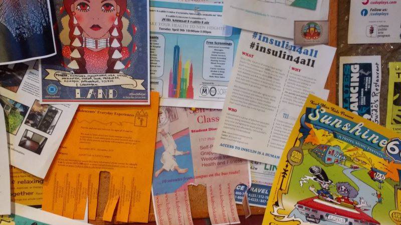
It’s no longer news, but it bears repeating: ours is a polarized society. From choosing between political candidates to identifying the color scheme on an internet dress, we are a society starkly divided. This month, I’ve discovered that Urbana-Champaign is just as split on the practice of posting and handing out promotional flyers. Examples of minutiae such as placement, colors, and adhesives all diverge in almost every conceivable possibility.
Even the question of whether it’s worthwhile to even post flyers at all gets a split decision. When asked, responses range from “crucial to getting exactly the kind of people you want at your show” to “a fucking pointless waste of time.”
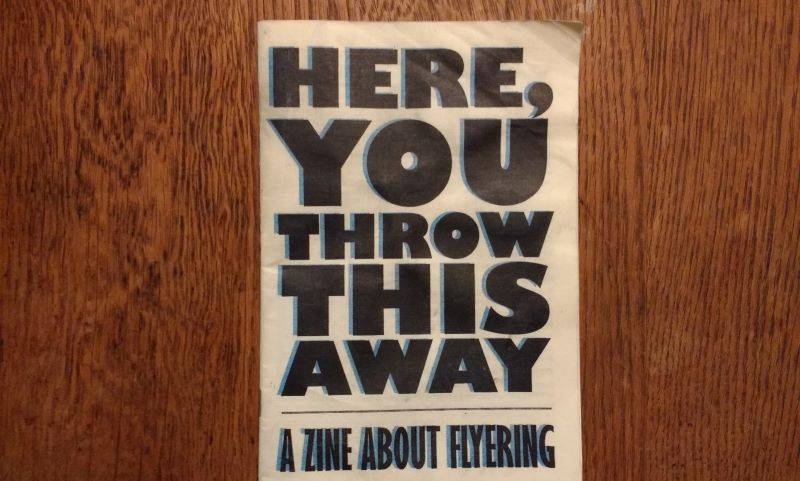
I’ve been mildly obsessed with questions about flyering since out-of-town comic Tyler Sonnichsen headlined a comedy night at Exile on Main Street on December 12th. That evening was a blast, and deserving of a full review, but it was the promotional material that stole my attention. After the show, Sonnichsen handed out a self-published, old-fashioned zine that served as a meta-commentary on flyering. It proved, to my utter shock, absorbing.
In the days after the performance, I flipped aggressively through “Here, You Throw This Away” (the zine’s title quotes an old Mitch Hedberg punchline on flyers). The tract details Sonnichsen’s views on flyering (he’s squarely in the ‘Pro’ camp), along with advice and recollections. The effect of reading this was revelatory in the same way that driving a new car can be: you start seeing other examples all over the place.
Having taken another look around in the past few weeks, I’ve noted four basic categories of posting locations that you, a potential local poster, may wish to consider. This is a broad first look, and by no means definitive or comprehensive.
Longevity: Urbana’s Main Street
If you are promoting, say, a recurring study, or perhaps an event that’s not coming up for another month or so, then this should be a priority consideration. Consistent foot traffic, and eye-level visibility offer a quality posting location. Urbana’s posters are spread fairly evenly along Main Street, between Race and Vine. If you have ever imagined a “typical downtown” frequency of posters distribution (and who hasn’t, amirite?), then this would be it.
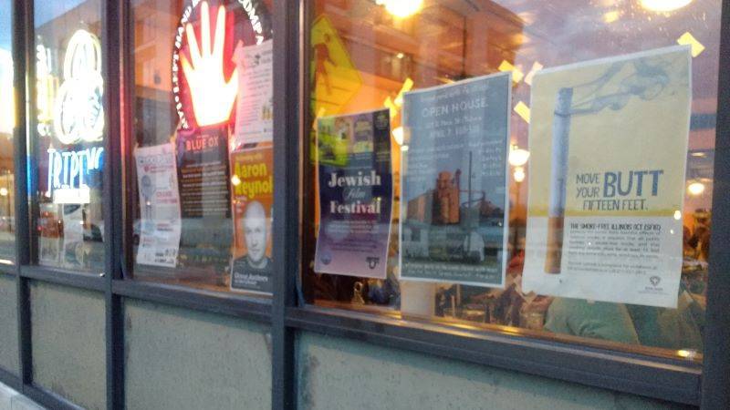
Several storefronts feature a few flyers whose posters have clearly taken the effort to go inside and ask permission to hang up their material on the inside of the storefront windows. These windows constitute the realm of scotch tape, and posters are placed at relative distance from each other. Storefronts offer a veneer of respectability and authority to its posters. As such, featured posters tend to share a professional aesthetic, and thoroughly constructed design.
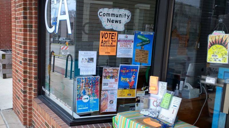
With less competition, each poster tends to “pop” a bit better, regardless of design or color scheme. Windows afford protection from the elements, so these posters tend to have a relatively longer half-life. However, a casual observer may not be as likely to read flyers in a more static environment, and one does not catch passerbys scrutinizing storefront posters as often as other locations.
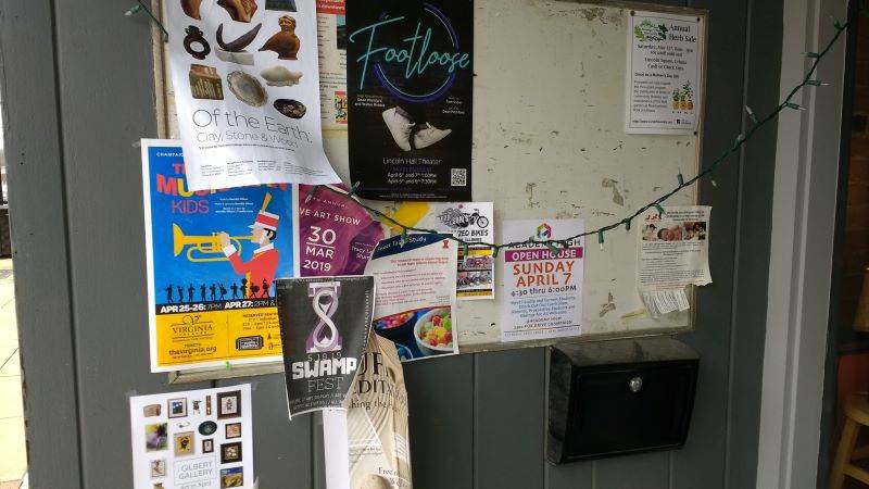
As an exception, the bulletin board outside of Dancing Dog Eatery on Main Street slightly contradicts all of these trends. It is in a prime location for passerby visibility, and so it is a bit more cluttered. Poster dates suggest a relatively higher (though not terribly fast) turnover rate than the nearby window fronts. Adhesives here include staples, thumbtacks, and tape. Designs remain generally professional, but this is a great spot for reaching the Urbana crowd if you are trying out a design of your own making, or if you have tear-off tabs.
Visibility: Independent Media Center, UIUC Campus (Outdoors & Cafés)
If you have, say, an event coming up straight away, and you just need a lot of people to see your promotion ubiquitously, then both the IMC and outdoor campus areas offer the massive amount of space that you will need.
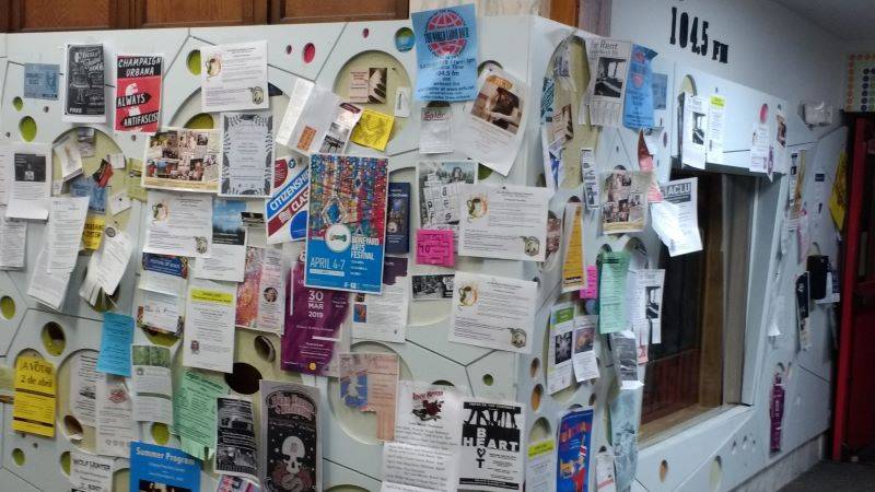
The entrance to the Independent Media Center is clearly a popular spot for posting up. The indoor shelter and copious thumbtacks are sure to give your image a good bit of staying power. However, the sheer amount of competition in such a small space can make this a bit of a proving ground for your flyer, as it will be jostling for space with dozens of others, many of which were clearly made for quick, easy distribution.
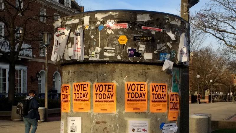
I admit that I am still unclear on the history of the big stone pillar outside of the Illini Student Union. Nevertheless, it’s obviously a prime choice for posts of all kinds, with guaranteed massive foot traffic, and a unique, eye-catching shape. Bring scotch tape, enough copies to optimize directional visibility, and the knowledge that the elements (as well as other posters) may cut short your poster’s life-span.
Both Espresso Royale locations on campus are also evidently popular posting spots, and can boast healthy foot traffic for quick visibility. Neither board is particularly “front-and-center” of the establishment, however, so this is an area where color scheme will be a great advantage for attracting the attention of a passerby.
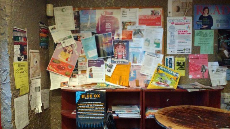
A major advantage for these locations is that they offer great opportunity to test what works, doesn’t work, and needs to further honing on potential designs. With so much competition, but also so much visibility, one should be able to gather a great deal of data feedback very quickly.
Durability: UIUC Campus (Indoors), Downtown Champaign
For promotions that you’d like to see stay up a little longer, but don’t need to be up more than a month, then the academic halls on UIUC’s campus and a couple of spots in downtown Champaign should be well considered.
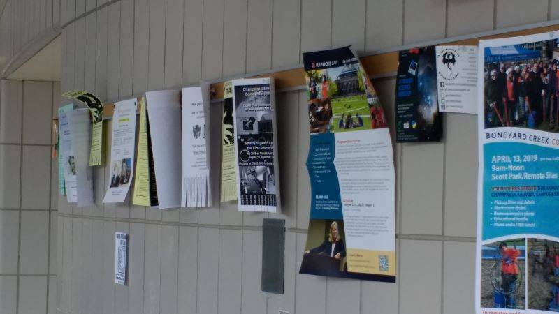
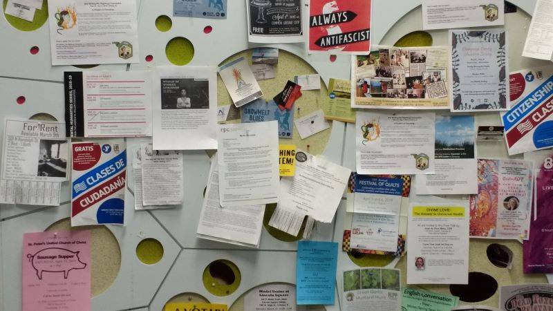
The Loomis Laboratory Physics Building offers a unique posting situation to anything I have ever seen. The long thin strip of cork board curving around the building’s ground-level lobby offers an ingenious way to manage clutter and space, so that individual posters have plenty of chance to breathe. Thumbtacks abound, too, for easy posting! There may not be as much foot traffic here as out on the quad, but your flyer should have a good chance to shine for a little while before other flyers take it over.
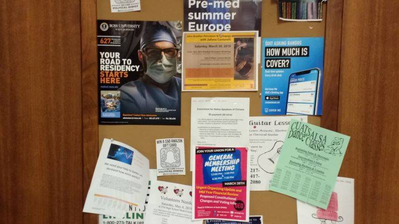
The indoor campus boards offer a nice balance between the security of Urbana’s storefronts and the casual intimacy of the outdoor campus spaces. A poster can post at will, but there it’s by no means a free-for-all.
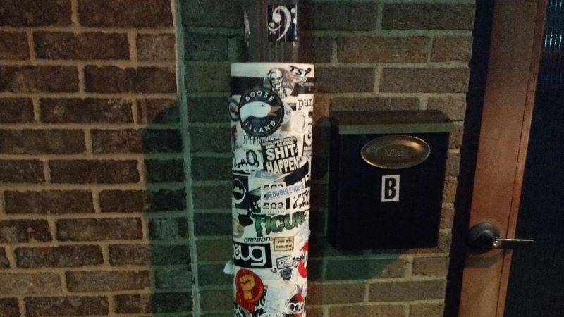
Downtown Champaign offers fewer immediate options for posting than Urbana or UIUC, but the spots that are available sport little competition, and the posters remain for a while. Champaign also exhibits a higher prevalence of sticker visibility, so for your long-term brand-raising, it’s a must.
Experimental
A couple of spots are downright strange, and while I cannot be certain of their merits for attracting the attention of passing strangers, they do serve as good test cases for experimenting with the form.
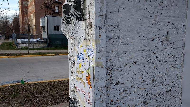
The sign case outside of the Channing-Murray foundation on UIUC campus has its own promotional events enclosed. The case itself has a significant number of flyers attached, but evidence of way more at one point in the mysterious past. The proliferation of staples suggests that this is a spot for longer-term and sturdier postings, and that this has long been an option for many posters, though perhaps not everyone’s first option.
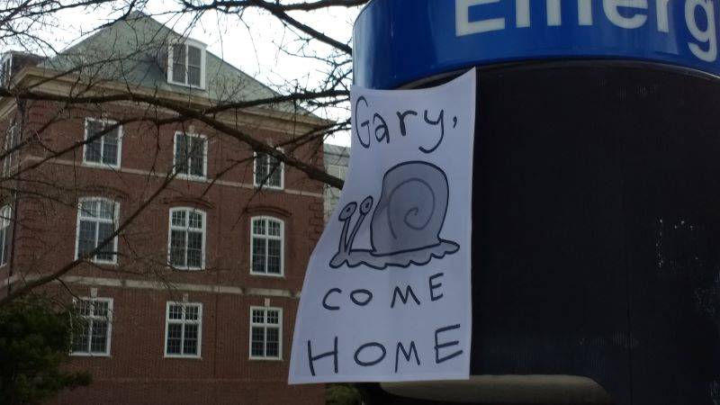
And still, some posters defy categorization by altogether.
Photos by Max O’Hern


