Hello dear readers. It’s time to start 2020 with a good, old-fashioned Building, Feeling, and Latrine.
A BUILDING
707 4th Street
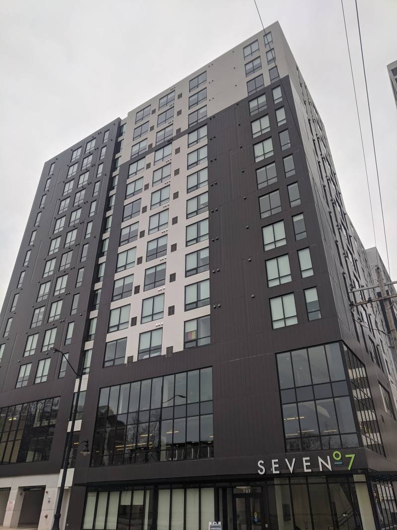
Image: A tall building that has light gray and dark gray sections and rows of windows. Above the door of the building it says SEVEN 0 7. Photo by Tom Ackerman.
It’s been quite a while since I ragged on a fugly grey rectangle. This one was completed (relatively) recently right next to most of the other fugly rectangles, so it’s high time I gave it a look!
First, let’s talk about the name. All these huge apartments attempt to have cool names. This building just goes by its address, “707” except of course it’s been stylized so it seems like more than an address. On their website they say “Seven07,” and the logo is just that, except that that zero is very tiny and high up and standing on a little line for reasons I can’t comprehend.
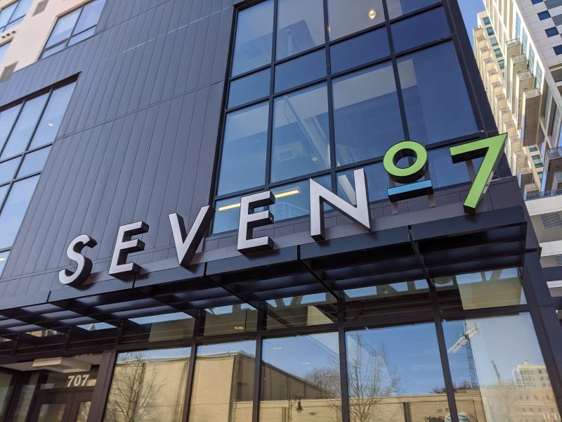
Image: A close of of the S E V E N 0 7 sign. The letters are in white and the numbers are in green. Photo by Tom Ackerman.
The number at least is a catchy number, and as building names go, it could be a lot worse (looking at you “HERE”).
Oh and if any readers at this point are yelling at their screen saying “but Tom, this fugly rectangle is black and white, NOT GREY.” I must inform you that you are quite wrong. When you get up near the building you can clearly see that it is in fact very dark grey, and very light grey.
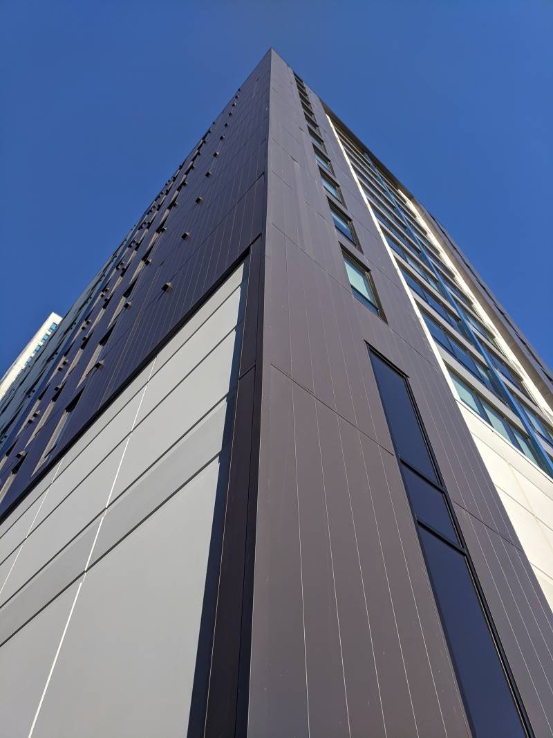
Image: A view of the corner of the building looking up from the ground. The background is blue sky. Photo by Tom Ackerman.
Moving around to the south side of the building, we can see the impressive width of this structure.
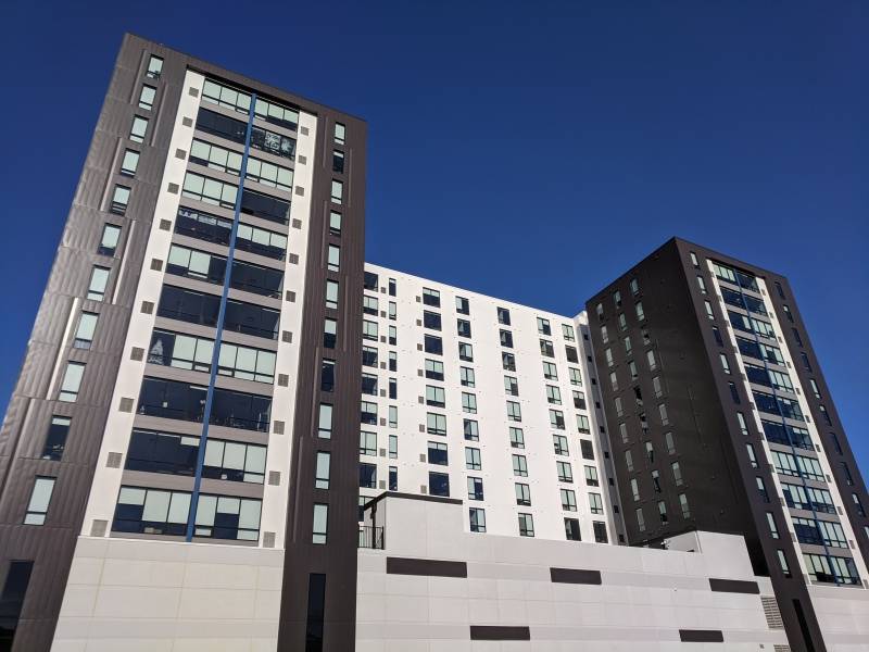
Image: A wide angle shot of the building. There is a dark gray tower on either side and the center section is light gray. There are rows of windows from top to bottom. Photo by Tom Ackerman.
From this angle, all I see when I look at this building is this packaging for the limited edition MOST STUF Oreos. Heh, they oughta call this “Sevenᵒʳᵉᵒ7.”

Image: A blue Oreo™ package that says Limited Edition Oreo: The Most Stuf. Most. Creme. Ever. There is a red triangle in the top left corner that says Nabisco, and a sideways view of an Oreo cookie on the right side of the package.
Two large wings surround what the website calls the “outdoor amenity deck.” It has a pool… and also floor lamps? Those are some serious amenities.
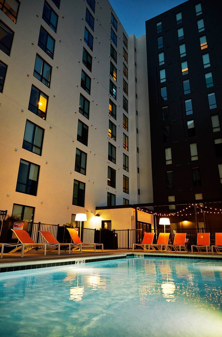
Image: A portion of a rectangular pool. There are orange beach chairs on the deck surrounding it, as well as two lamps that are lit. There is a patio with strings of lights and two sides of the building in the background. Photo from liveseven07.com.
The parking garage wall has these sections of the dark grey siding slapped on willy nilly. If I were more artistic, courageous, vandalous, and had access to a substantial ladder, I’d make a mural on this wall turning it into a Mega Man level.
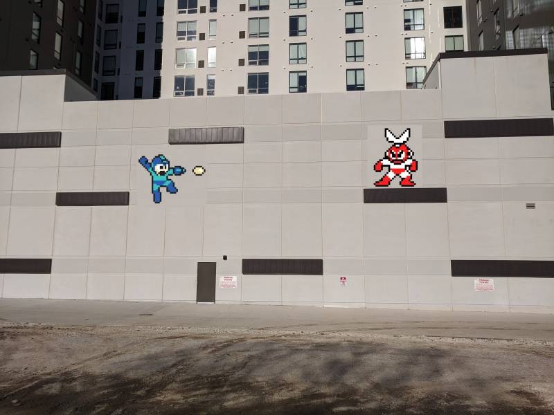
Image: A mostly light gray wall with several dark gray horizontal rectangles placed sporadically. The writer added images of a blue Mega Man character and red and white Mega Man character. An empty parking lot is in the foreground. Photo by Tom Ackerman.
Finally, I gotta talk about the bike racks on the north side of the building. They look pretty unique, letting you store your bike right on the wall, saving maybe 14 inches of precious sidewalk space!
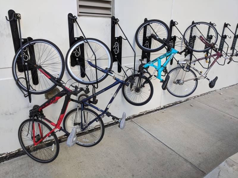
Image: Several black bike hooks are attached to a white wall. There are four bikes, each hanging from a hook by the front wheel. Photo by Tom Ackerman.
I definitely should have included these in my bike rack roundup from last year. If I had, these racks would’ve gotten a failing grade though. Even though they’re novel, they’re hard to use, and also clearly very shitty. A number of them were missing the bar that you’re supposed to actually lock your bike to, and several others are about to have that bar fall off.
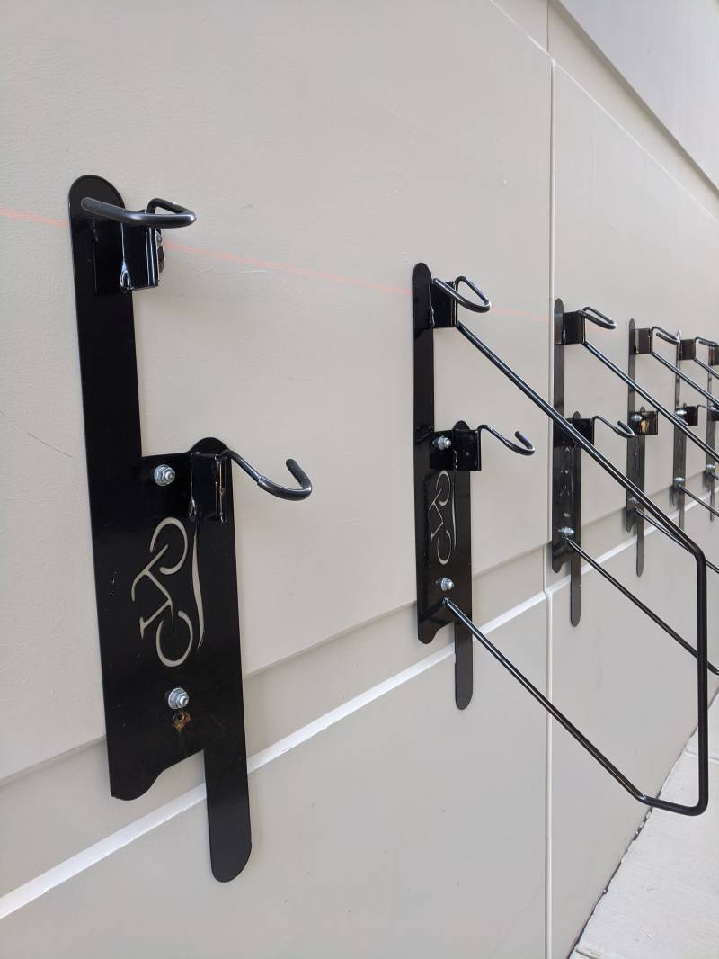
Image: A close up few of the black bike hooks attached to a white wall. They each have a hook and a metal loop, the first one is missing the loop. Photo by Tom Ackerman.
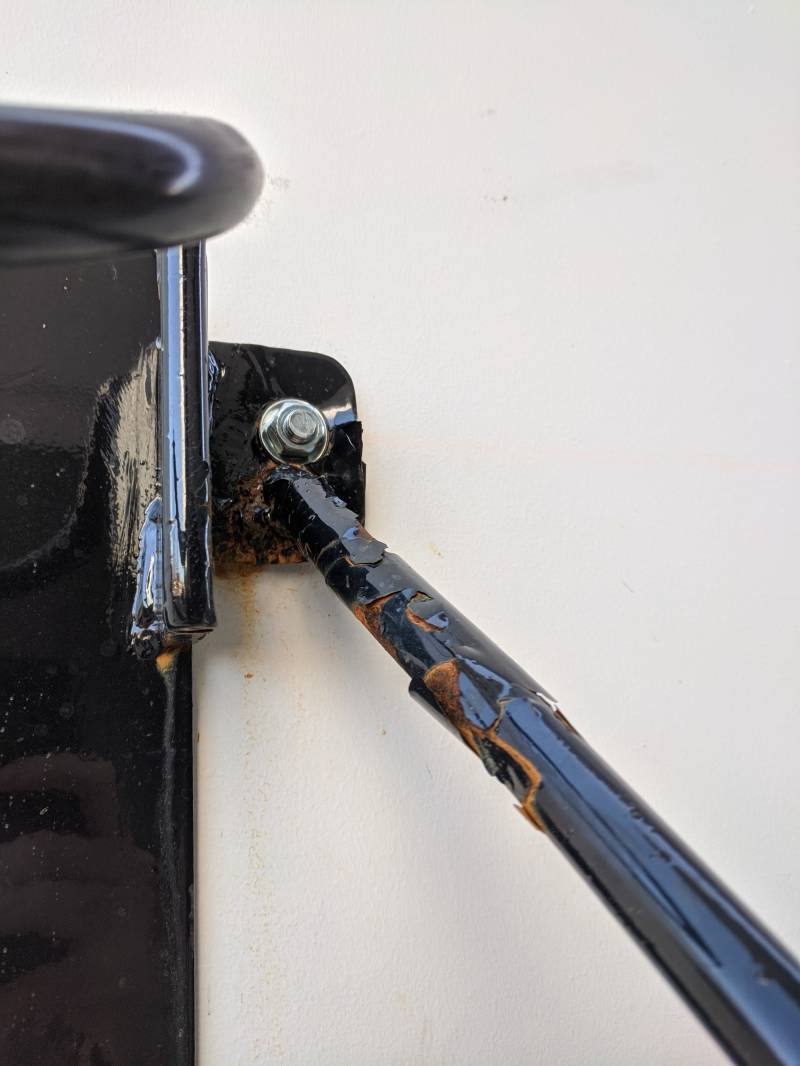
Image: An extreme close up of a portion of the bike hook. It shows a black bar that is beginning to rust. Photo by Tom Ackerman.
I recommend you not park here.
VERDICT:
Sevenᵒʳᵉᵒ7 is not the worst fugly rectangle, but it sure ain’t the best. However this stock photo and promotional text on the Sevenᵒʳᵉᵒ7 website really speaks to me.

Image: Two women are riding skateboards on a skateboard ramp and smiling. Text superimposed over the photo says: Find your style, find your rhythm. Photo from liveseven07.com.
I’m adding it to my 2020 inspiration board.
A FEELING
Looking in holes, thinking about what used to be there
Sure seems like we have more than our fair share of construction here in Chambana (well really just in Champaign). So, I’ll often find myself looking into a big hole in the ground where some stuff once stood, and where some bigger stuff will soon be built. Nobody can resist looking down a big hole, but the hole pictured here is special because I did homework here like twice back when it was the basement of Espresso Royale.
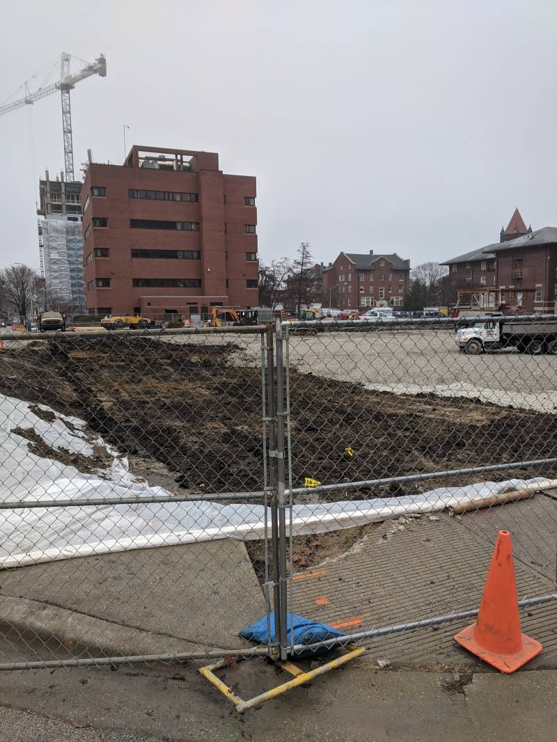
Image: A construction area surrounded by a chain link fence. There is an orange safety cone in the foreground. Behind the fence is a large hole in the ground. Beyond the hole you can see buildings and a crane. Photo by Tom Ackerman.
Wow, all those (two) memories just came flashing through my skull!
VERDICT:
Don’t ever miss a chance to look at a hole and get nostalgic.
A LATRINE
The Men’s Room at Barrelhouse 34
Barrelhouse 34 recently celebrated their 4th anniversary of opening. It’s a bar that I enjoy visiting (especially when I can sit on the upstairs patio), however, I’ve still never been able to determine what kind of “vibe” they’re going for. There’s certainly a LOT of wood in the interior (much of it made from barrels, that part makes sense), but there’s also a strangely high number of unutilized pulleys? As well as some swords and shields? I struggle to glean a coherent theme from all of this. Is it Frontier Don Quixote? Is it Westernpunk with a dash of SWORD? Is the theme just WOOD & WROUGHT IRON?
Thankfully, you don’t have to think about any of these questions when you get to the restroom. All of the weirdness ends. In fact, all of the wood ends abruptly, with the only wood in the room being the door itself.
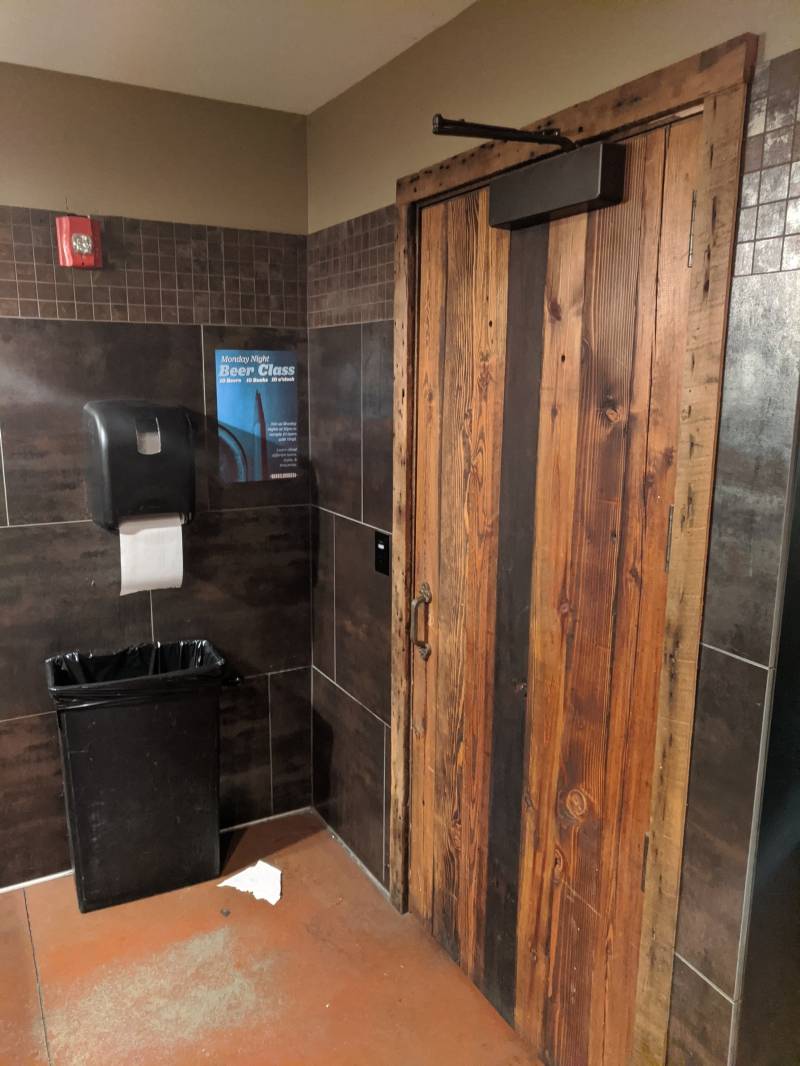
Image: The corner of a bathroom. There is a large wooden door to the right. To the left is a black rectangular garbage can with a black paper towel dispenser above it. The walls have dark grayish brown tile. Photo by Tom Ackerman.
Instead of wood, the bathroom is clad in several types of shiny tiles, all brown. We’ve got some decent urinals and a spacious stall complete with tiny trash bin.
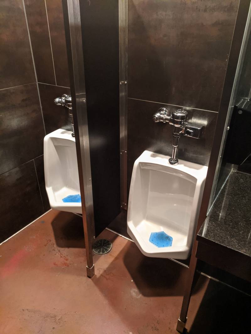
Image: Two white porcelain urinals separated by narrow black wall. The floor is brown and the wall has large grayish brown tiles. Photo by Tom Ackerman.
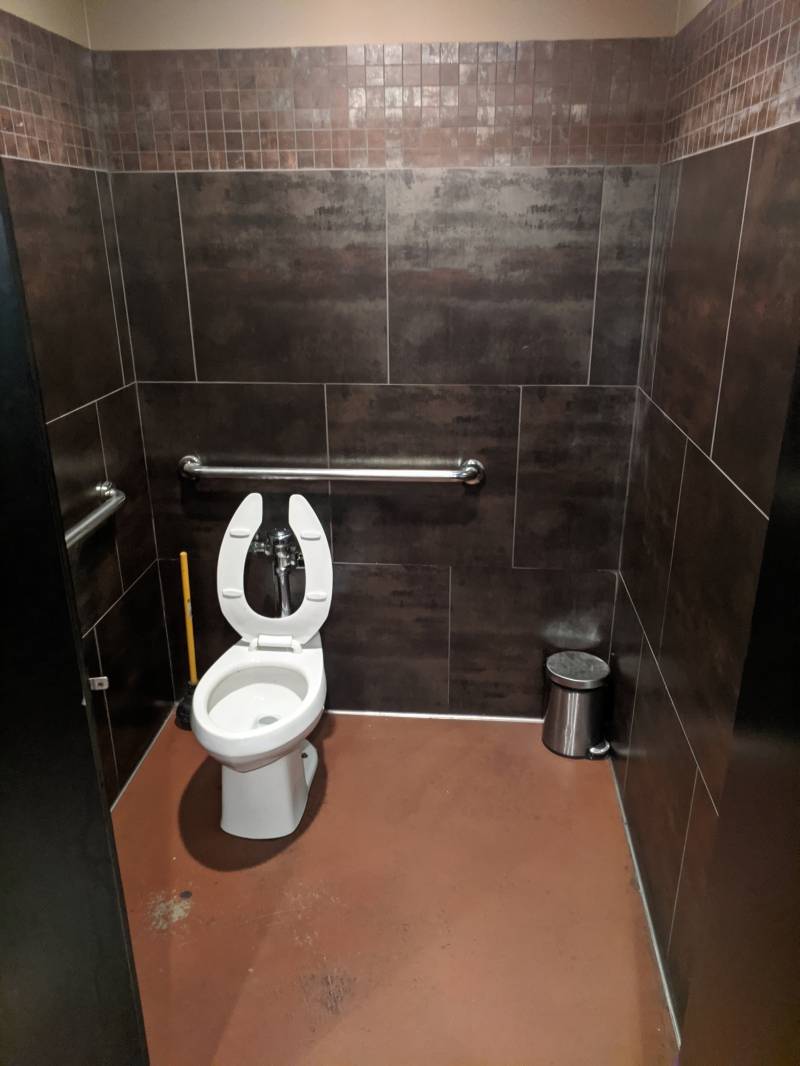
Image: A bathroom stall with a brown floor and dark grayish brown tiled walls. There is a white porcelain toilet with the seat up on the left side, and a small metal trash can on the right side. There are two metal handles on the walls of the stall. Photo by Tom Ackerman.
The caged lights over the mirror match some of those out in the bar proper (I forgot to mention “cage lights” in my list of weird stuff this bar contains).
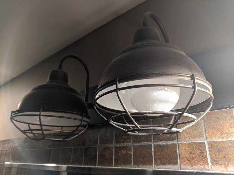
Image: Two lights are attached to a wall. The lights have round metal cage-like covers. The top portion of the wall is painted dark gray. Below the painted portion are two rows of small light brown square tiles. Photo by Tom Ackerman.
The sinks are a strong point in this bathroom’s favor. I always appreciate a sink that’s both deep and wide so I can really move my hands around when washing.
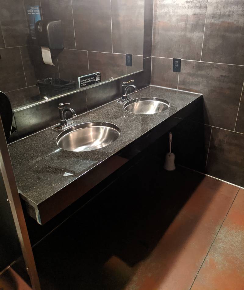
Image: A double sink with black marble counter and stainless steel sinks. A large rectangular mirror is above the sink. The floor is brown and the wall is large grayish brown tiles. Photo by Tom Ackerman.
The stainless steel looks pretty good too, and the fake aged brass faucets put the water right where I need it to. There’s two sinks, which is nice, but only one soap dispenser, which inevitably leads to awkward moments as one person is forced to reach over to get some soap.
VERDICT:
One of the better bar restrooms in downtown Champaign. The owners should take it up to the next level by installing some iron pulleys and mysterious swords. Or maybe just add some more wood? That seems to be their thing. Dang, I just googled “wooden urinal” and did not get many hits, but that just means that somebody with some know how and a can-do attitude could make a bunch of money filling that gap in the urinal market.


