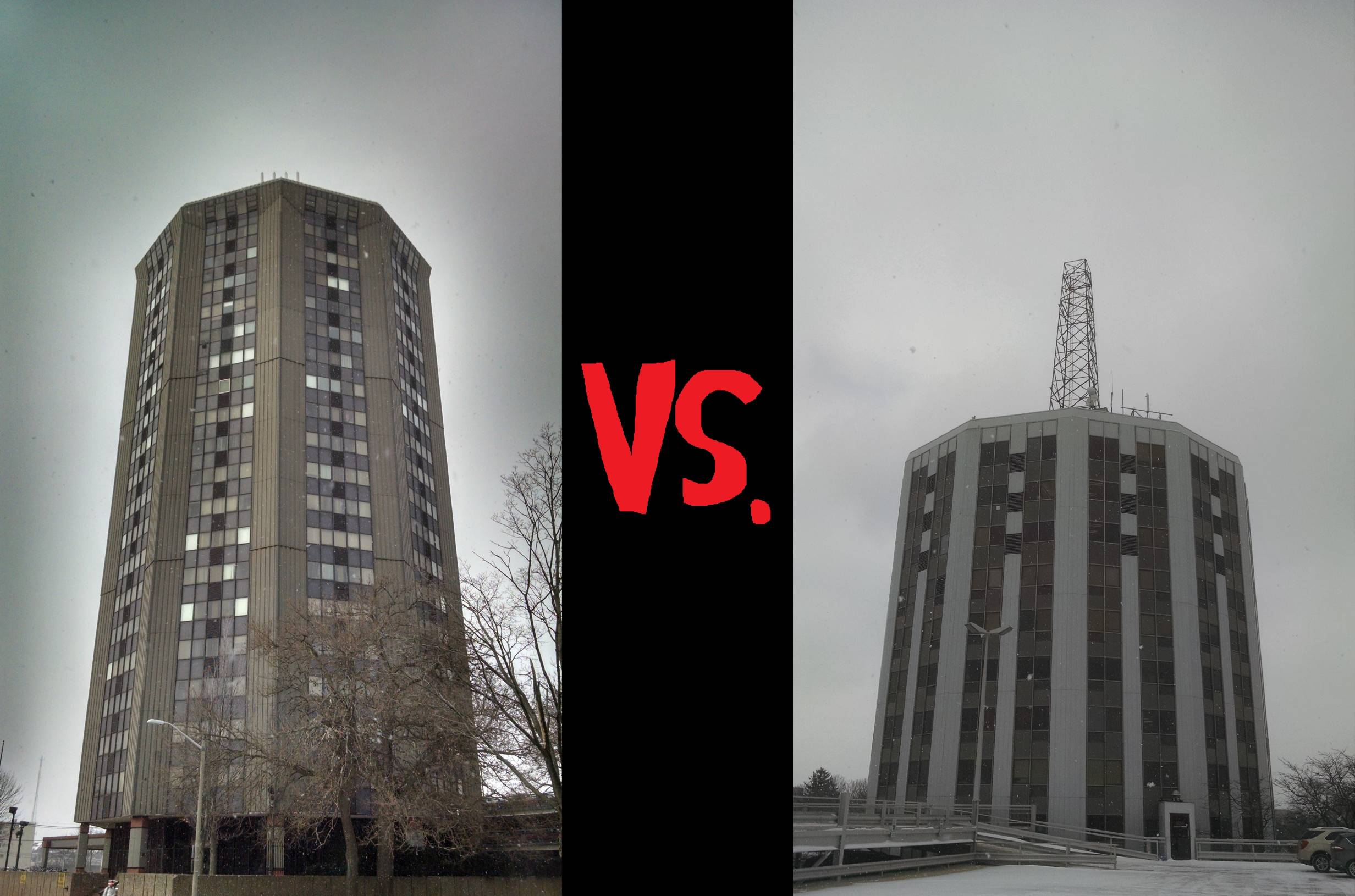
Astute readers will have noticed that I replaced the feeling in this month’s column with a second building. That’s right folks, we’re gonna have an ole’ fashioned Building Battle. TWO TOWERS WILL ENTER, BUT ONLY ONE CAN WIN, with the loser being unceremoniously bulldozed and its remains used to fill potholes throughout Central Illinois. There is still a featured latrine though, because I need to fulfill my contracted number of pee jokes or else I’ll be fired.
TODAY’S MATCH (SHOWN ABOVE):
THE TOWER AT THIRD (LEFT) VERSUS HUNTINGTON TOWER (RIGHT)
WHO WILL REIGN AS CHAMBANA’S ONE TRUE TOWER?
Let’s meet the fighters.
Note: it was snowing when I staged this fight, so I’m sorry about the image quality, but also, be grateful about what I go through for you dear readers.
A BUILDING:
The Tower At Third (located at 3rd and John)
If I had to choose one word to describe The Tower At Third, it would be “sinister.” Maybe you’ve never really noticed The Tower At Third, but if you take more than a passing glance at it, you’ll realize that it would be right at home in the fiery, filthy, Los Angeles cityscape of Ridley Scott’s Blade Runner. If this building were just 20 stories taller, it would definitely be the headquarters of a malevolent megacorporation from an 80s sci-fi action movie. Just look, the top story of the tower has windows that angle downward, providing a perfect view of the downtrodden masses for the greedy board of directors sipping their cognac and smiling wickedly. Above that is a host of very pernicious-looking antennae. Surely some of these must be used to contact orbiting spy satellites or control a team of cyborgs assassins. And also, look at the entrance to the building. The Tower At Third has it’s own logo, and it definitely looks like the logo of a faceless and equally moral-less conglomerate.
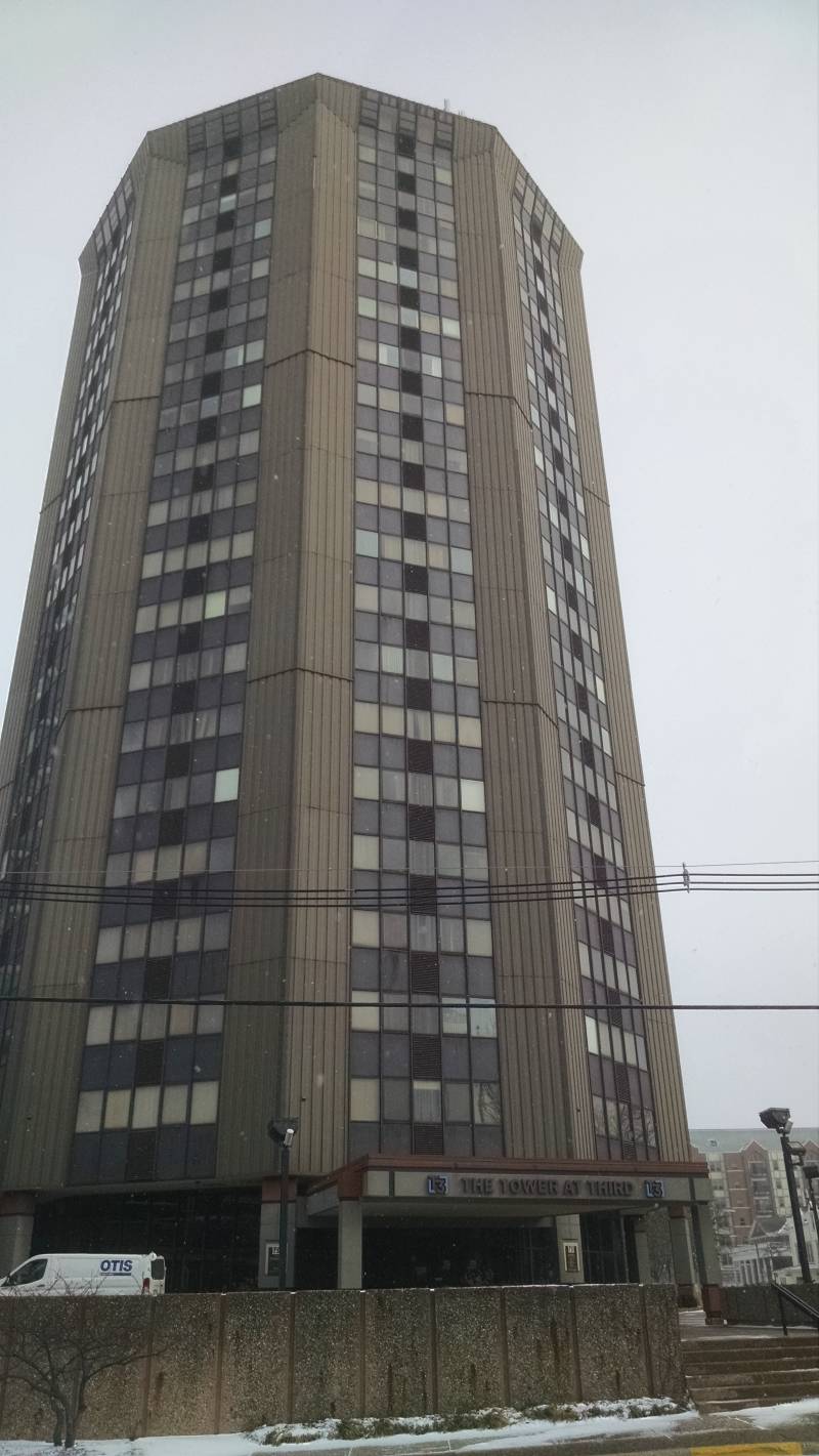
Let’s talk about the color of The Tower At Third for just a moment. It is brown. Now, let me be clear here, I like brown. Brown might very well be my favorite color. Most of my clothes and possessions are earth tones, like real earth tones, meaning the colors of actual dirt from the ground. However, I do not like the color of The Tower At Third. It is not the friendly brown of UPS trucks and Snickers wrappers, it’s a grimey, uncaring brown.
A BUILDING:
Huntington Tower (located at Springfield and Randolph)
Whereas The Tower At Third is the vile color of cold, stale sewer water, Huntington Tower is the color of Eeyore from the Winnie the Pooh series, and seems to have the same disposition as that glum stuffed donkey. This is a building that just seems weary. While The Tower At Third appears to have been weathered by the harsh winds and acid rains of a dark cyberpunk future, Huntington Tower has clearly just been weathered by normal ass weather. It’s got rust spots in places. Its grey paint scheme may have started out looking faded right from day one, but now looks downright pallid. In a mild fog, Huntington Tower would completely disappear. Furthermore, notice that in answer to The Tower At Third’s array of menacing antennae, Huntington Tower just has a single, old style radio antenna, and even this looks to have been shorn off at some point in time because it doesn’t actually reach a point.
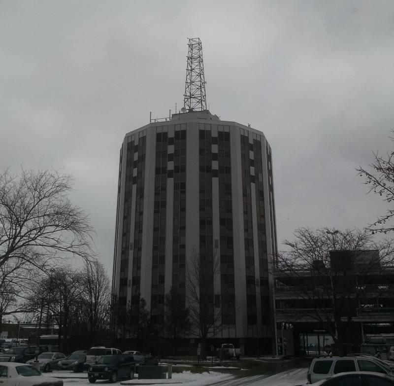
All this leads to the sense that Huntington Tower is past its prime. I imagine a time though, many years ago, when Huntington Tower was something special. With its complete antenna, it was probably the tallest structure in Champaign for a while. And I’m sure its unique cylindrical structure was quite a statement among all of the red brick edifices of old Chambana. Yes, Huntington Tower must have been a real beacon of progress and prosperity when it was first built. Actually, I like to think that these two buildings were both designed by the same person at different points in their life. Huntington Tower, an interesting combination of commercial and residential space, the product of a young idealistic designer, and The Tower At Third, drafted by that same individual, years later and much more jaded. (if I had some days to research this, I could probably figure out exactly who designed these two buildings, but I have a deadline fast approaching, and also I don’t want to ruin the beauty of my own musings).
THE WINNER:
Huntington Tower may seem like an underdog, but IT WINS MY CHAMBANA TOWER TUSSLE! By virtue of the fact that it has 12 sides to Tower At Third’s paltry 10. More sides = better building, period. You can’t argue with math.
A LATRINE:
The Men’s Room at Ambar India
Now that the building brawl is over, we can get down to what I know you readers are really here for: potty stuff. Recently, I was at Ambar India, partaking of their lunch buffet, when I decided to check out the bathrooms between my second and third helpings. The Ambar men’s room is undoubtedly a nice facility but a few things make this bathroom rather unique.
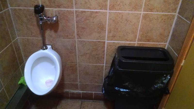
Next to the urinal was a bright green washcloth. I imagine it was there because sometimes things get out of hand at the urinal, am I right guys? (I apologize for that joke).
Then, there’s the sink area. As you can see, it’s organized in a fairly standard fashion, except for the paper towel dispenser barely sandwiched directly in between the light and the tiny mirror. This is the kind of space efficiency I would normally see in a bathroom a quarter this size. There’s plenty of other wall space where this towel dispenser could have been placed, and yet, here it is above the sink. Also, the sink mirror is so small that they clearly had to make up for it by hanging a larger, nicer mirror on another wall.
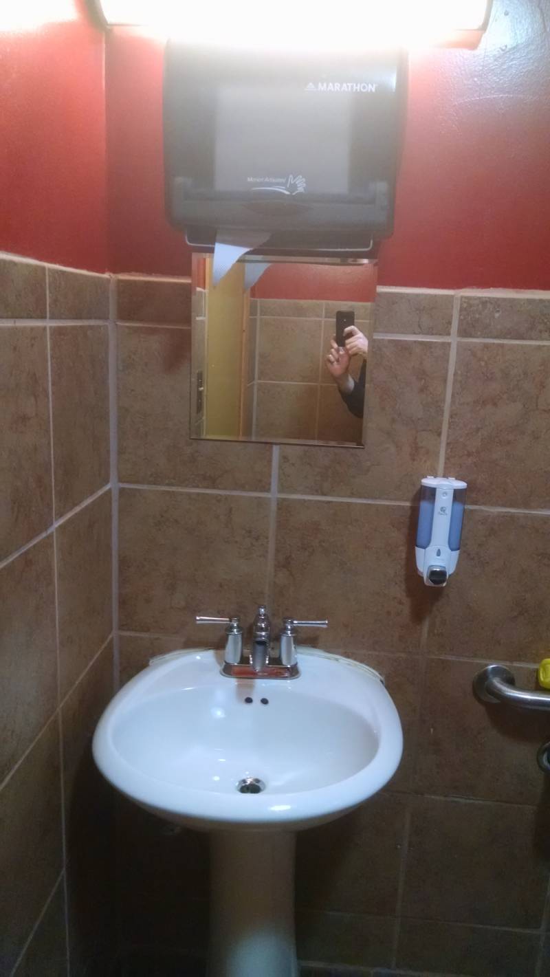
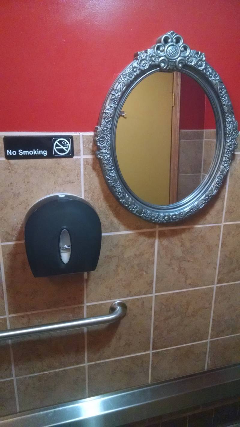
Maybe there is something to this arrangement though. I mean, usually after washing my hands, I have to move somewhere to find the paper towels, and in that time my wet hands are spewing buckets of unclean hand drippings everywhere, but with this placement, all my hand drippings go right into the sink where they belong. Genius.
Finally, my favorite part of this bathroom is the faucet. While most faucets just have a plain nozzle that shoots the water nearly straight down, this faucet is a little trough that gently spouts the water outward. Not only does it look cool, this faucet totally bypasses the issue that some bathroom sinks have where the water output is so close to the rear wall of the sink that I end up jamming my knuckles against the sink just to get my hands damp.
VERDICT:
A lovely bathroom, but short people might have trouble drying their hands.
Know of two buildings that have a beef and need to battle it out? Notify me in the comments!


