


Art is all around you. Every book cover, movie poster, advertisement, menu, logo, website, business card, t-shirt, newsletter, and brochure is created by an artist. And some are better than others.
Several weeks ago, I took in some culture at Parkland Community College in Champaign. The Art and Design Student Juried Exhibition featured photography, sculptures, ceramics, paintings, metals, two- and three-dimensional design, and on and on and on. I recently visited the art gallery again to see their Graphic Design Student Juried Exhibition. These particular works are on display until June 20, and I’m happy to say I got to see some incredible stuff before it’s whisked away to its owners.
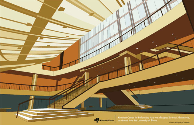
One of the very first things I saw was a poster for The Krannert Center by Mark Melvin. The colors are America, circa ’60s, and the image is incredibly sharp. It made me think of Andy Warhol, if only because of the sharpness of it. The point of view of this piece is from the bottom of the staircase that leads to Krannert’s Great Hall. Those steps that lead up to the main lobby are from the late ’60s, but they somehow look modern, almost futuristic, in Melvin’s poster. One of the best parts of this piece of art is the interesting fact revealed. I’ll let you find it…
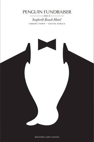 Scott Sheltra created an illustration that caught my eye because of its simplicity and clever imagery. This poster is for a penguin fundraiser, and, I have to say, I would probably go just because of Sheltra’s handy work. The entire illustration is a chest; it’s the top half of a tuxedo. The white part of the chest, the shirt, is actually a penguin, upside-down. The text above is simple, elegant, and in perfect harmony with the tone of the whimsical and understated illustration. When I took this one in, I smiled and nodded.
The part of graphic design I appreciate the most (at least in my very limited experience) is simplicity. If you can convey a message in just a few shadows, lines, or words, you’ve got me. I’m sold. One design that got my seal of approval was Matthew Farrell’s logo for Krasavin Realty. A large K presides over the entire logo, and a house is nestled in the negative space of it. That’s it. A house is constructed out of the bottom part of the K with a tiny rectangle that is practically the universal symbol for “door.” Impressively undiluted.
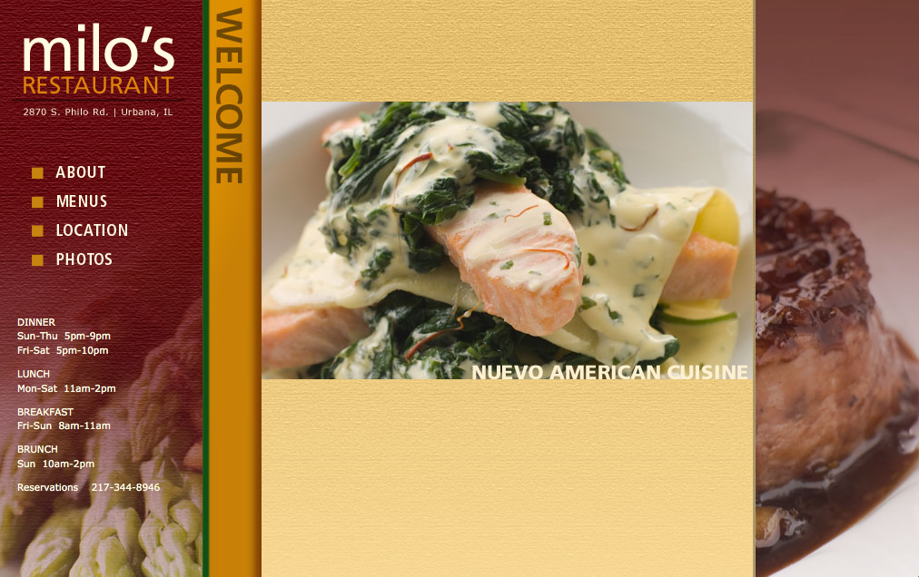
Around the corner, on the other side of a dividing wall in the center of the gallery, are the websites. A tucked-away sign reads, “These interactive web entries are available on the computers to the right.” How exciting! Real art, real graphic design, in real-life application! I browsed one site for a local restaurant, Milo’s, where I worked right out of college. The owners are some of the most generous, wonderful people I’ve ever known, and I was instantly drawn to the corresponding project by name alone. Once I delved in, I was reminded why some websites are successful and others go unvisited. This site has photos and menu options that are easy to navigate — a must in any site — as well as mouth-watering descriptions of Obdulio Escobar’s food creations. I had to stop browsing because I realized it was well past a normal lunch time, my stomach was empty, and I was just torturing myself.
One of the most important things about a restaurant menu is its readability. If people sit down and everything is easy, they’re inclined to order plenty and, more importantly, have a good time and tip generously. I am not a fan of the multiple page, book-style menu. I don’t want to go leaf by leaf, discovering what’s on each page, considering, flipping back, and wondering what to get. I want an eyeful. Unfold the restaurant and there it is. Salads, appetizers, entrees, wine, and dessert laid out before me, like a map to my full belly. I want to see my big, fancy dinner in one go.
Mark Melvin (of the Krannert Poster Melvins) created a beautiful menu for Craft, Tom Colicchio’s restaurant in New York. (I’m happy to say I’ve dined at Colicchio’s Craftsteak at The MGM Grand in Las Vegas. It may be why I looked at this menu in the first place. The word “craft” has been linked in my mind, permanently, with the most amazing roast chicken I’ve ever tasted.) Melvin’s design has a great flow and sensible division of categories. It makes sense. It makes me want to eat one thing from each column. A menu should be effortless; this one is.
One thing I cannot stand in graphic design is any kind is inconsistency. A cluttered, sloppy design creates a roadblock in my brain. It might be linked to my tendency to mentally edit anything that crosses my path, but it’s more than that. When a brochure has typos and strange spacing, that’s what I notice. I cannot read the message as easily. Whatever is being put into my brain should get there with no protest. Want me to donate to your cause? Use bullet points throughout or don’t use them at all. Do you have a new play for me to check out? Choose your font style and size so I can read everything at a glance. It may seem like I’m being snobby, but, to be frank, details matter.
One restaurant menu I picked up at the exhibit used the Oxford comma only sometimes. (It doesn’t matter if you know what that is, because you can see with your eyeballs that one list of ingredients is presented one way and another is presented … not that way.) It didn’t flow, visually, because of the inconsistent nature of the phrasing. Things like that actively bother some (anal retentive) people. They also go over the heads of others who are far less uptight than I.
The point is this, Students of Design: Your attention to detail will get you some attention of your own.
A perfect example of this attention to detail is in a newsletter for Common Ground Food Co-op. When opened, it provides a thorough selection of delicious recipes and products, organized perfectly for optimal comprehension. The words along the right side of the front cover say, “from the ground up,” with the phrase going — you guessed it — up. This word-play-turned-visual-frollic is why I love going to these kinds of events. There’s someone out there, a student, who really knows what’s what.
The Graphic Design Student Juried Exhibition runs until June 20. You can see everyday art at its roots and gain some insight into what goes into that graphic tee you’re sporting.