Last week, I went to Krannert Art Museum to check out Modernist Strategies: Highlights from the WPA (on view through December 23rd). It’s a small, very well curated exhibition, located in the very first gallery — the Kinkead Gallery — on the east side of the building, right after you pass through the Kinkead Pavilion. The exhibition currently consists of ten works, all of which are in KAM’s permanent collection.
The Works Progress Administration (WPA) was an agency established in 1935 during the second New Deal to employ out-of-work Americans, including a whole lot of artists who made artwork for federal buildings. The artists were employed by the United States government through the Federal Art Project (FAP). What’s that, you ask? The federal government paid artists to make art? Oh yes indeed, and so much of what we Americans laud as Exemplary American Art was made in this time period, and so many “great” American artists — Jackson Pollock, for instance — were once employed by the WPA.
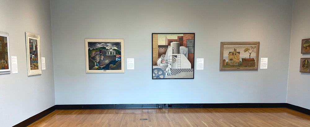
Photo by Jessica Hammie.
I do not have the space here, or, frankly, the energy, to unpack all the nuanced meanings of modernism in an art historical context — I suggest you check out this website, if you’re interested — so forgive me for this abbreviated explanation. The easiest way to think about modernism as an organizing theme related to this specific exhibition is to consider the context in which these works were made. The New Deal was implemented in 1933 by the Franklin Delano Roosevelt administration to combat the grave effects of the Great Depression. Putting people to work through programs like the WPA was one way to help people out of poverty. The early 20th century was a moment of great advancement and great destruction. Humanity was still recovering from World War I, where almost 40 million people died. The telegraph, telephone, and radio made information more accessible, connecting continents. Following WWI, immigration quotas limited the number of people eligible to enter the United States, stoking nationalist and white supremacist tendencies. The stock market crash of 1929 and fallout fast-tracked a global depression never before seen, in a world that had never been so intimately connected.
Sounds sort of familiar, right? It seems obvious to me that curator Kathryn Koca Polite selected these ten works not only for their technical and formal qualities, but also for their resonance with this contemporary moment. While it’s not a perfect comparison, we are currently in a moment (both domestically and globally) in which people are suffering from economic collapse and a global pandemic, and accounting for all of the ways in which white supremacy and capitalism have basically ruined everything. It’s pretty similar, except in the 1930s very few fucks were given about white supremacy and capitalism as destructive forces.
There were a couple of things about this exhibition that immediately struck me: the variety of formal approaches on view, and the fact that so many of the artists were immigrants. The subject matter focused on daily life is a solid example of modernism, generally, but it’s the current moment of unemployment, wealth hoarding, and the fight for workers’ rights coupled with last week’s news of another billionaire rocketing himself into space for funsies that had me thinking about how so little has changed in this country.
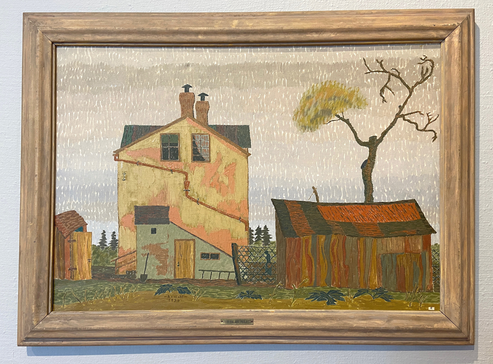
Frederick Remahl, Stucco House, oil on canvas, 1936. Photo by Jessica Hammie.
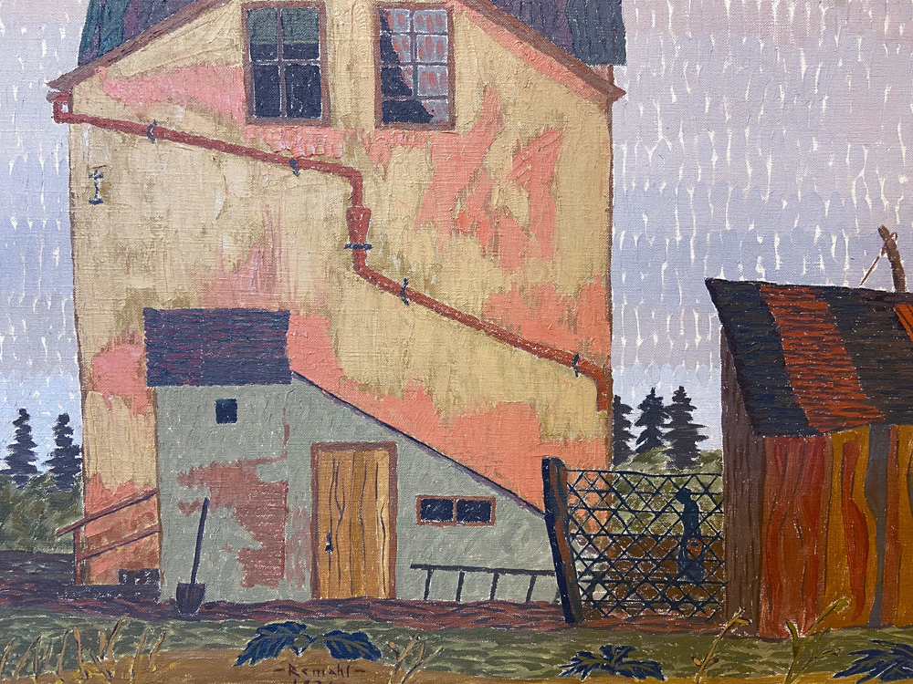
Ninety years after the New Deal, too many people are still living hand to mouth. In the 1930s, rural America simply did not offer the same standard of living as urban American. Frederick Remahl’s Stucco House (1936), with its muted earth tones and almost stingy paint application, shows a house just left of center. On the right of the canvas is a semi-dilapidated barn; on the left of the canvas is a small building that looks to me like an outhouse, which many rural homes still had into the 1930s. There’s a human walking behind a fence, dwarfed by the enormous house. I can’t help but think of the onus of having to care for such a looming monstrosity, especially when money is scarce. It’s an image that speaks to the desolation and devastation of the Great Depression, but in this contemporary context reminds me of many vistas I’ve encountered driving through rural parts of this country. While rural America now has electricity and indoor plumbing, there are plenty of areas that do not have access to what we now consider basic utilities, such as high speed internet and cell phone reception. This process of the electrification of rural America is immortalized in The Power Plant (1936) by William S. Schwartz. Here Schwartz pictures a hydroelectric power plant in a lush, verdant setting. It’s a mash-up of the seemingly untouched past with the technologically advanced present/future, not unlike looking out onto the horizon in 2021 and seeing it dotted with wind turbines.
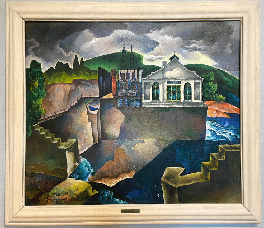
William S. Schwartz, The Power Plant, oil on canvas, 1936. Photo by Jessica Hammie.
Bringing electricity to rural America was a major project of the New Deal, which is how so many people finally gained access to indoor plumbing (thank you, FDR). The Power Plant is in many ways the inverse of Stucco House in that it is painted in a quasi-Cubist style, with rich, saturated colors. Though you might think of American modernism as a flat, starkly representational style à la Grant Wood’s American Gothic (1930), this exhibition literally demonstrates the variety of influences on these American artists. Take, for example, the two still life paintings by Waldo Glover Kaufer, done in a surrealist style, and the very flat, geometric, almost abstract painting by Hilaire Hiler. They are formally very different, because the artists who made the paintings had different aesthetic interests and influences.
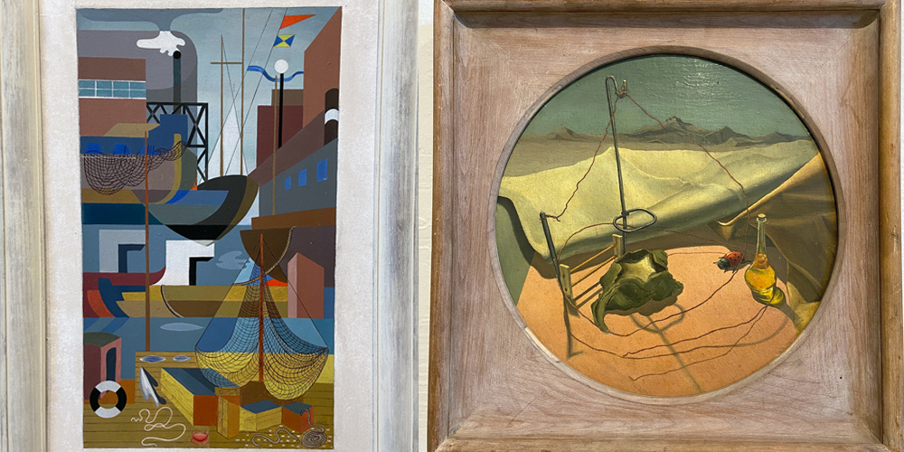
(L) Hilarie Hiler, Fishing Port, oil on masonite, 1936. (R) Waldo Glover Kaufer, Beginnings of Desolation, oil on canvas, ca. 1934-1943. Photos and image by Jessica Hammie.
Arguably most illustrative of that point — and admittedly my favorite pieces in the exhibition — are the two prints by Julius Land Elk Twohy (Two-vy-nah-up), the only Native American artist working in the Washington state FAP. Speed, Color, Action and Blessed Pony (both ca. 1940) are gorgeous lithographs that employ stylized Native American imagery to create dynamic patterns on paper. Though technically representational, the flattening out of the warriors and ponies, respectively, result in beautiful abstracted patterns. The images are mostly symmetrical along an upper left to lower right axis, which creates a dynamic composition. They’re really lovely, and what a gift to have access to the work of such a wonderful artist. You can taxonomize these prints with the work of the European-American artists in the exhibition through the formal qualities they share (a flattening toward abstraction, for instance). But I think it’s worth considering the biographical and social context, too: what does it mean to be an immigrant, or be different in America, who belongs, and where they belong. These are conversations that we continue to have today.
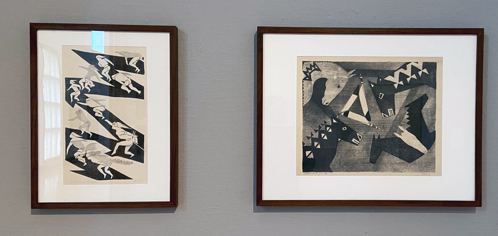
Julius Land Elk Twohy (Two-vy-nah-up), Speed, Color, Action (L); Blessed Pony (R), both lithographs ca. 1940. Photo by Jessica Hammie.
Modernist Strategies: Highlights from the WPA is on view through December 23rd. It’s a fantastic, smart exhibition that is deserving of your attention. The wall text describes the exhibition as an ongoing installation, suggesting that some works will be swapped out. Do yourself a favor and visit soon, and then visit again to see how the newly installed works expand the conversation.
Modernist Strategies: Highlights from the WPA
On view through December 23rd
Krannert Art Museum
500 E Peabody Dr
T-Sa 10 a.m. to 4 p.m.


