From now until March 29th, Krannert Art Museum and Kinkead Pavilion will be featuring MetaModern, an exhibit focusing on design objects of the mid-century. Featured artists of the exhibit include: Conrad Bakker, Constantin Boym, Kendell Carter, Jordi Colomer, William Cordova, Elmgreen & Dragset, Fernanda Fragateiro, Terence Gower, Brian Jungen, Olga Koumoundouros, Jill Magid, Iñigo Manglano-Ovalle, Dorit Margreiter, Josiah McElheny, Edgar Orlaineta, Gabriel Sierra, Simon Starling, Clarissa Tossin, Barbara Visser, and James Welling.
 While the roots of modernism are planted in function and utility, the pieces featured in MetaModern challenge this traditional notion. Artists turn what was once useful into something decorative, something simple into elaborate, in a section of the exhibit titled “Form Elaborated / Function Denied”.
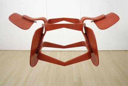
Artist Edgar Orlaineta constructed a unique piece consisting of two red Eames LCW chairs, titled Narcissus (above left). The chairs are attached to one another by their legs and are suspended in the air, invoking an image of an eternal embrace between the two and paralleling the myth of how Narcissus fell in love with his own reflection. The chairs cease to have any utility once they are joined and suspended, straying from the conventional principles of modernism, but instead transform into an intriguing piece of art.
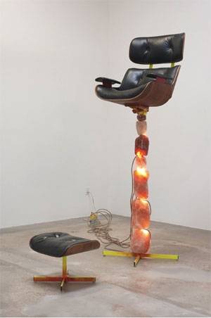 Another work that immediately caught my attention was Olga Koumoundouros’s Triumph Over Survival (right), featuring a leather lounge chair (from Charles and Ray Eame’s 1956 Lounge Chair and Ottoman) fixated on top of a stack of Himalayan salt lamps. The contrast between the two objects used is what drew my eye to the piece. Initially, I didn’t recognize the salt lamps for what they were, but saw them solely as rocks. With either understanding, however, my first thought provoked by the piece is applicable: there is a striking contrast between the natural, ancient salt lamps and the modern, manmade leather chair. More than that, the leather chair is also an “emblem of technology,” as is stated in a description of the piece, further emphasizing the juxtaposition of the two objects. The same description notes that this unlikely pairing “defies the basic premises of modernism, questioning its call for clarity, honesty, and permanence.”
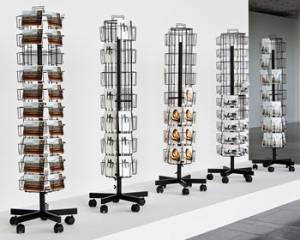 Moving on to the “Worn and Torn” section of the exhibit, I came across a piece that made me contemplate whether it was an installation in the show or if it was simply a somewhat out-of-place location for a small gift shop. Barbara Visser’s Detitled (left) showcases design classics in the form of postcards, stripping the original pieces of their function and status as such. Visser presents the cards on multiple postcard racks, aligning them with “a banal souvenir photograph of a national monument or scenic view.” This description was particularly humorous to me, as I am part of a postcard-penpal program; as such, I never associate postcards with being “banal.” Visser’s take on these original modern pieces was very creative and clever, and the way in which she presented her piece was incredibly successful in fulfilling her purpose. Her intention of treating the design icons are mere cards from a museum gift shop was powerfully achieved as evidenced by my being tricked into thinking the cards on display were on sale as souvenirs.
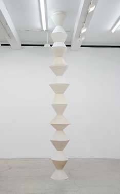 One of my favorite pieces from the show is found in the exhibit’s “Conceptual Copies / Material Transformations” section. Using reclaimed lamp shades, a metal rod, and some light bulbs, William Cordova transforms Constantin Brancusi’s 1918 Endless Tower into his own precarious stack of lamp shades (right). In this piece, form follows function as the pillar of lamp shades exposes itself as a working light. The brightness of the lit up column (unfortunately not depicted in the photo) immediately attracted me to it as I approached it with a childish smile on my face. The lights provided a refreshing change in mood from the room that I had just come from, which had put me in a more serious, deep-in-thought mindset; this new piece also helped me feel less anxious about the eerily unsettling music (which I later realized was coming from a video also featured in the exhibit, discussed below) filling the current room. The visibly messy glue that held the lamp shades together reminded me of an elementary schooler’s arts and craft project, contributing to the playful and happy atmosphere surrounding the piece.
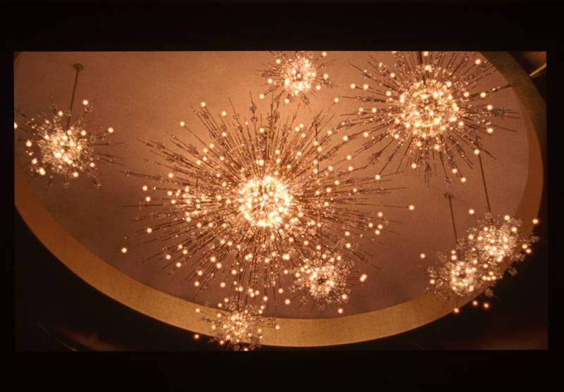
The last part of the show, “Scenes Re-seen”, featured the aforementioned video, Island Universe, by Josiah McElheny. With an ominous score of slightly haunting and off-key piano composition, my mind was prepared for an uncanny presenation from the get-go. The video focused on chandeliers that, to me, were reminsicent of a multitide of probes. The chandeliers featured in the video were designed in the same year as the discovery of the first data supporting the Big Bang Theory, two seemingly unrelated events that McElheny views as signals of modernism’s declines. The video, in retrospect, isn’t as spooky as I tricked myself into thinking it was. But at the time of my viewing it, the dark room paired with the characteristic music caused me to interpret everything as a bit creepier than it actually was.
Below: screenshot from Island Universe
The aforementioned works make up just a small portion of MetaModern, an exhibit showcasing works that are not only wildly inventive but also fun and greatly thought-provoking. My visit was initially met with lots of confusion, intimidation, and at times, even apprehension, but after delving further into the context surrounding the pieces, I am fascinated by the creativity and symbolism behind each work. The exhibit is free to view and will be on display at Krannert Art Museum until March 29th; I recommend everyone to visit if possible, to see the pieces I’ve discussed for themselves as well as to view the ones I didn’t get a chance to write about.
Photo credit: Krannert Art Museum


