To see some top-notch Natural Science illustrations, check out the current exhibit at Anita Purves Center in Urbana put on by the Illinois Prairie Chapter of the Guild of Natural Science Illustrators. The exhibit runs until the end of this month and features a number of images with subjects from the natural world—birds, moths, a crayfish, an octopus, and many more. The illustrations were created by guild members using a variety of media, from pen and ink to Photoshop.
Guild member Carie Nixon is one of the displayed artists. I spoke with her recently at the Nature Center. She said of the purpose of the show, “We like to exhibit here at the Nature Center because most of our work is nature-oriented. I also like to show people what the difference is between illustration and art. I consider illustration part of art, but it’s not really fine art. It’s not art for its own sake.”
What Natural Science Illustrators do
In the exhibit literature it says, “Scientific illustration is the production of graphic images that help the scientist-author to communicate.” Scientific illustrators create images for textbooks, exhibits, and more. They work more on assignment than on inspiration. In fact, many of the images in the exhibit were commissioned or required in the first place for scientific purposes. Nixon explained, “Most of these are pieces that were done for a purpose—some publication somewhere, but maybe they didn’t get chosen.”
According to the exhibit literature, members of the Illinois Prairie Chapter of the Guild of Natural Science Illustrators “include biological, veterinary, and medical illustrators, photographers, sculptors, and scientists.”
Nixon herself works at the Illinois Natural History Survey at the University of Illinois. Some of the pieces are for sale. Others aren’t, in some cases because they are copyrighted to whomever the original assignment was done for.
Scientific illustration comes with specific challenges, especially for illustrators trying to figure out exactly what their client wants. Nixon explained, “Some illustrators are also scientists, but most of our illustrators are not scientists. They have to work with a scientist from his description—maybe his little rough sketches, or maybe he has some specimens. But the illustrator has to use their talent and ability to draw and illustrate what that scientist wants to show. It may be a new species. It may be a small piece of an organ, but it has to be what that scientist is envisioning.”
Although the purpose of natural science illustration is to reproduce the natural world as accurately as possible, human illustrators do what cameras can’t. Nixon said: “Very often with a drawing it’s actually easier to see what you’re trying to show than with a photograph. If you take a picture you’re very often getting too much information; it can be very confusing to try to direct attention to what you’re trying to look at. With a drawing, you can direct the eye; with a photograph you can’t – other than maybe going in with Photoshop and removing what you don’t want. The simplest illustration of what you want is usually the best.”
Technology
Scientific illustrators today have more media to work with than in the past. Software programs like Photoshop and Adobe Illustrator give illustrators more options, although they haven’t changed the basic principles of the work.
Nixon said of the advantages computer technology can give an illustrator: “Both Photoshop and Illustrator are just tools. You can draw something with pen and ink, or with paint, but you have features with those particular software that, let’s say, mimic. Also, you always lose a little bit when you’re scanning.”
She continued with a laugh, “The biggest advantage to using Photoshop and Illustrator is the ‘undo.’ Perhaps you’ve drawn something that comes out very well to your eye, but you show it to the scientist and he says ‘Well, this piece here is a little bit smaller than how you show it.’ With Photoshop and Illustrator, you can go back and change it without starting over.”
Natural science illustrations are created on computers, not merely tweaked. According to Nixon, illustration fundamentals need to be mastered before booting up the hard drive: “Most of the scientific illustrators who are breaking into the field now, they have to know how to do this newer stuff. But you have to know how to draw first. You have to have that eye for proportion and three-dimensionality.”
Where art and science meet
The exhibit literature includes a section defining Natural Science Illustration. One sentence that sticks out is: “The illustrator should produce an accurate rendition of the subject, and the work should be pleasing to the eye in terms of balance and illustration.”
So is it more important for an illustration to be accurate or to look good? Or are the two criteria really the same thing?
Nixon said, “You have to remember that with illustration—although you follow some of the basics of composition to have a pleasing-looking picture —you’re not to use what you would normally call ‘artistic license’. You must render your subject accurately and scientifically correctly.”
Natural science illustrations sometimes become valued for aesthetic rather than scientific reasons. Nixon noted, “Many of these pieces do end up being shown in peoples’ homes, although that wasn’t why they were assigned.”
Sometimes features that strike the observer as attractive weren’t necessarily meant to do so. For instance, I pointed out a lovely orange color to Nixon on her own illustration “Grote’s Sphinx Moth.” I asked her if she emphasized this particular shade of orange for its attractiveness. She replied, “I did it exactly like the specimen. The only thing I didn’t put in it is the pin.”
Nixon also said, “I think I would consider myself a scientist first and an illustrator second. I don’t think I would call myself an artist. I can look at something and I can reproduce it, but pulling in that little extra you need to call it fine art… I don’t think I’m doing it.”
 But even if the intent wasn’t to create fine art, some pieces in the exhibit come across more that way than others. Nixon and I discussed two illustrations hanging side by side on the wall: one is of a Barn Spider, the other is of a Jumping Spider. The Barn Spider was drawn with pen, ink and watercolor and the Jumping Spider was drawn with Adobe Photoshop .
Nixon said of the Photoshop spider: “This one would be a good one for a book about spiders. If you want to know what the spider looks like.” She said of the pen, ink, and watercolor spider: “And this one does show what the spider looks like, but you might want to hang it on your wall. You might want to make it the cover of the book.”
Moreover, a sense of playfulness can be found in some of the illustrations that seems to go beyond the strictly scientific. For instance, an illustration of some toads consuming a slug has the cute title: “Three Tiny Toads, But Only One Slug Snack.”
A diversity of illustration
It says in the exhibit literature that each piece gives “the artist’s own unique perspective on nature and the world around us.” Different artists are doing different things.
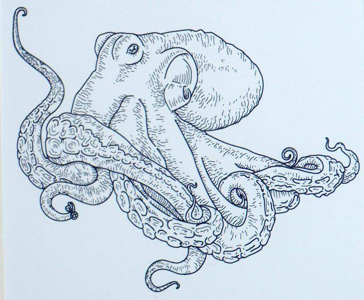
“Octopus” (see picture) by Rachelle Rogge is notable for its elegance and simplicity—just a no-frills image of the creature itself suspended on a white background. Nixon said of the artist and her picture, “She’s able to get the depth, the three-dimensionality with very few lines. And all in black and white.”
An artist whose displayed pictures are very different from the others is Lucy A. Synk.
In “Planet of Another Color,” Snyk depicts a scene from an alien planet. At first glance, the image appears to be pure fantasy: the leaves on the trees are purple and there are odd-looking creatures flying through the air. But everything is how it is for a reason. In a written explanation next to the picture, Synk explains that she made scientific conjectures about what things would look like on another planet and drew accordingly. She even consulted with a scientist at NASA about how the natural landscape of other planets might look. 
The leaves on her trees are purple because the alien planet is receiving light from a different type of star than our sun. The creatures in the air have the number of limbs they do because of the gravity specific to the planet. I’d describe it as a kind of science fiction illustration. It’s an astonishing picture.
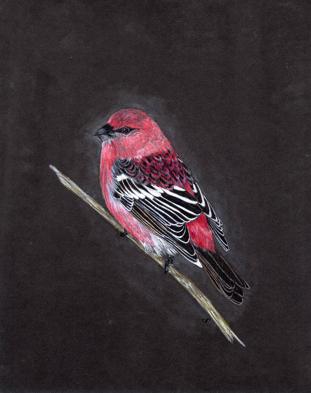
I asked Carie Nixon what her favorite illustration from her own exhibited work was, and she said that it was one of a Pine Grosbeak (see picture): “It’s my favorite because it’s a bird, and a whole bird, and birds are my main focus as a biologist. I was trying to get the feather structure and the patterns: I love looking at something and determining the pattern.” She added, “I drew this particular bird just because I wanted to.”
Many of the illustrations in the exhibit revolve around the theme of “feathers,” which was decided on as one subject for the exhibit. Some of these feather illustrations were created specifically for the exhibit, while others were created for past commissions.
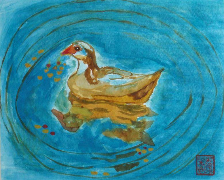
These feather pictures range enormously in complexity. On the simple side of things, “Red Tailed Hawk Feather,” by Joanne Brummet, is of just a single feather. At the other extreme, Ian Wang’s illustration “Duck in Pond” (see picture)—according to the author himself—explores themes of harmony between humans and the environment.
Nixon said of the show’s feather theme, “We were just illustrating different ways an illustrator could interpret a subject. Each person has a different set of skills.”
The National Guild of Natural Scientific Illustrators, Inc. began in 1968 at the Smithsonian so that illustrators could get together to exchange ideas and network. The Illinois Prairie Chapter of the guild began here in Champaign County for pretty much the same reason in 2000. Most of the members of the Prairie Chapter work professionally in some capacity in art and illustration. People wishing to join should contact Carie Nixon at cnixon@illinois.edu.
 Conclusion
Whether it’s for practical or artistic reasons, people have been reproducing nature visually for a long time. Consider the 17,000 year old cave paintings of black bulls and other animals found at Lascaux, France. Drawing nature seems to be a universal human urge that’s as strong today as it’s ever been—whether it’s a child scrawling v-shaped birds on construction paper with Crayolas or a scientist using Adobe Illustrator to create a diagram of a bird’s wing for a textbook.
The pieces in this exhibit represent just how good people have gotten at holding up a mirror to the natural world around us. But in the mirror’s reflection, we see ourselves as well. Intended or not, there’s a stamp on all of these illustrations—an aesthetic if you will—that belongs to the human animal alone.


