Last week, Giertz Gallery opened its most recent juried exhibition to showcase the talents of its graphic design students. It might seem odd to consider walking into a gallery to see movie posters, menus and websites on display, but considering this is (at least) the third one locally this year, I’m suggesting we begin to acclimate.
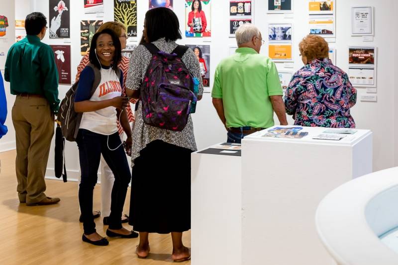
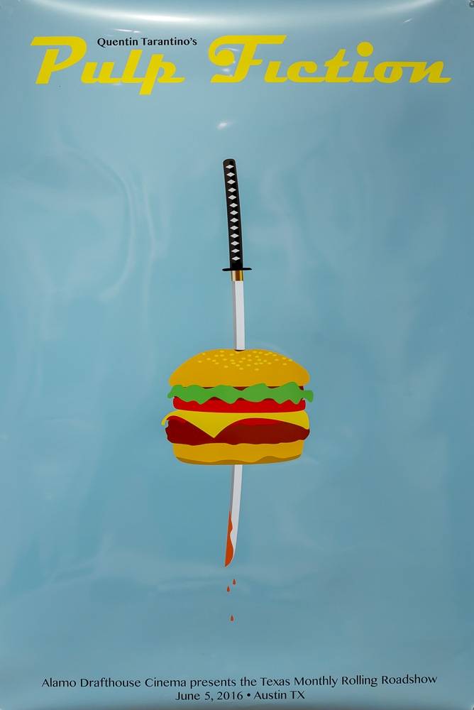
One thing I truly enjoyed about walking through this particular gallery was feeling an immediate, strong, visceral reaction to everything I came across. The fact that all of this art also serves a functional purpose was a revelatory experience for me, because I realized just how quickly my mind could be changed about something based on whether or not I liked the promotional materials. When a work grabbed me, I began to consider the product favorably, regardless of my previous feelings. When I didn’t like a work, it made me think twice about whether I wanted to continue to support the client. Sure, most of us have at least seen a clip of Don Draper proselytizing about just this thing, but I hadn’t consciously experienced it until I attended this show.

For example, King Kong isn’t a favorite film of mine. I’ve seen the black & white version and the recent remake, and I don’t feel the need to ever revisit either. One of the first posters I saw upon entering the gallery, however, was a monochromatic brown where darker shades formed a giant gorilla hand reaching for the letters in the title. The lighter background shade between the fingers created a crown shape that encompassed the title. The simplicity and balance made me smile and nod thoughtfully, and I began to feel favorably toward the movie. On the other hand, one of the book trailers playing on repeat on the screen was for a book I have read and liked, but the art-voiceover-music combo didn’t really appeal to me and I caught myself wondering why I would have ever read something like that. It made me realize just how much sway design has over our thoughts and feelings.
I know that I am very susceptible to my environment; aesthetics of all kinds – visual, climatic, and audio – have generous influence over my mood and enjoyment. To that end, one thing I didn’t find myself enjoying was the loop of film entries. Four short video works play continuously and as I spent more than a half-hour in the gallery, it began to grate. There are three computer monitors displaying interactive design entries, and I wish the film entries had been subject to the same “sleep” capabilities.
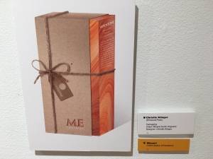 Another realization brought to my attention by this show is how much functionality and practicality factors into design. Aside from movie posters and book trailers, there were websites, menus, ad circulars, company stationery and even re-imagined packaging on display. The most successful designs were clean, simple, and most importantly: easy. An award-winning packaging design featured just a piece of hemp twine holding together a natural wrapping. It matched, looked appealing, and hemp actually stays tied when you tie it. On the other hand, one suggested menu design featured individual papers contained in a folded envelope. Aside from the nightmares my server-self was imagining, the execution of the design made it difficult to pull the sheets out, and I gave up, cranky. My boyfriend liked the idea, because he thought it make specials easy to swap out, so it just goes to show that even functionality is subjective.
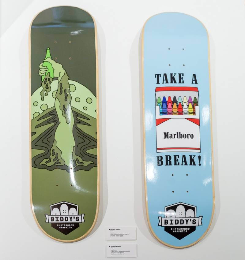
I mentioned award-winning. Recognition awards were given by local companies such as CUDO, [co][lab], and Surface 51. Certain categories, like typography, had “Best in Show” awards as well, provided by Parkland. These awards were presented last week during the opening reception, preceding a talk by instructor Liza Wynette, whose quote struck me while I was contemplating the exhibition. She says, “While fine artists can ask questions, commercial artists have to answer them.” It’s not as easy as it sounds, and certainly earns my appreciation.
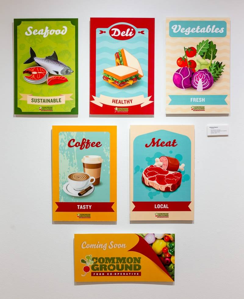
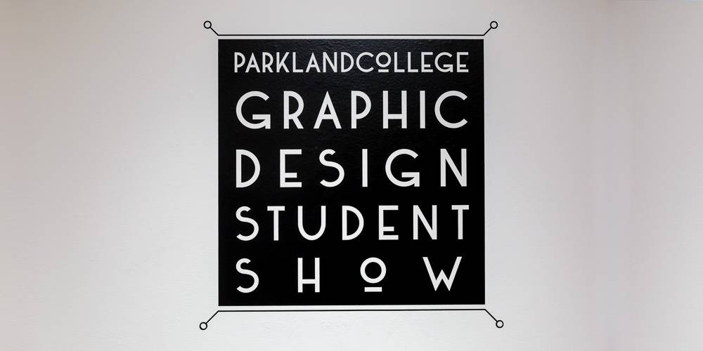
Parkland College’s Graphic Design Student Show is currently exhibited in Giertz Gallery, in the X-wing of the college, which is located at 2400 W. Bradley Ave. The show will be on display through May 28th, and spring hours are in effect: Monday through Thursday from 10 a.m. – 7 p.m. and Saturday noon to 2 p.m.
All good images taken by Scott Wells. The one slightly blurry iphone photo courtesy of my boyfriend.
About Scott Wells:
Scott is a U.S. Navy veteran and a graduate of the University of Illinois. He has been a photographer and writer for Smile Politely since March of 2015.
About Rebecca Knaur…
As Arts Editor, rk spends too much time considering minutiae and altering her mood through beverage. Follow her hypercritical ramblings on Twitter (@rknaur) if that appeals to you.


 About Scott Wells:
  As Arts Editor, rk spends too much time considering minutiae and altering her mood through beverage. Follow her hypercritical ramblings on