If you live in the Champaign Urbana area, I can almost guarantee that you’ve seen Dan Wild’s work around town. You’ve probably seen several of his works without even knowing it! That was the case with me. I mean, to be perfectly honest, when it was suggested I write an article on this cool local artist, the name didn’t immediately click. But the minute I went on his website, I immediately began to recognize his work as interesting and clever advertisements that I had not only seen, but taken note of—works that I had actually pointed out to a friend saying, “Hey that’s cool!”
Like the 217 Heating and Cooling Inc. billboard that you see in downtown Champaign:
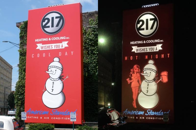
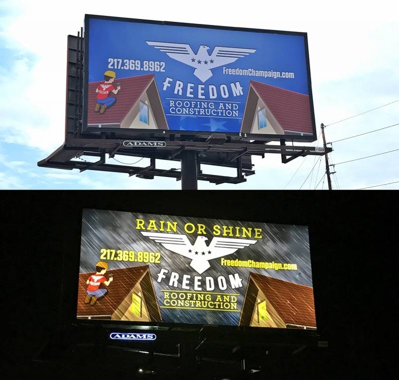
And in case you never noticed before, these designs are actually backlit so they change from day to night, as you can see above.
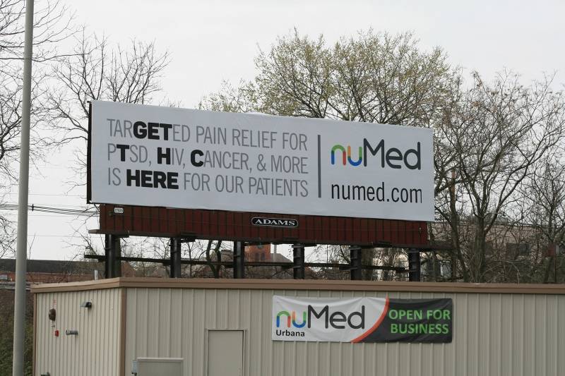
There’s also the NuMed billboard that I know I had seen before:
And if neither of those ring a bell, here’s a couple others you might have seen.
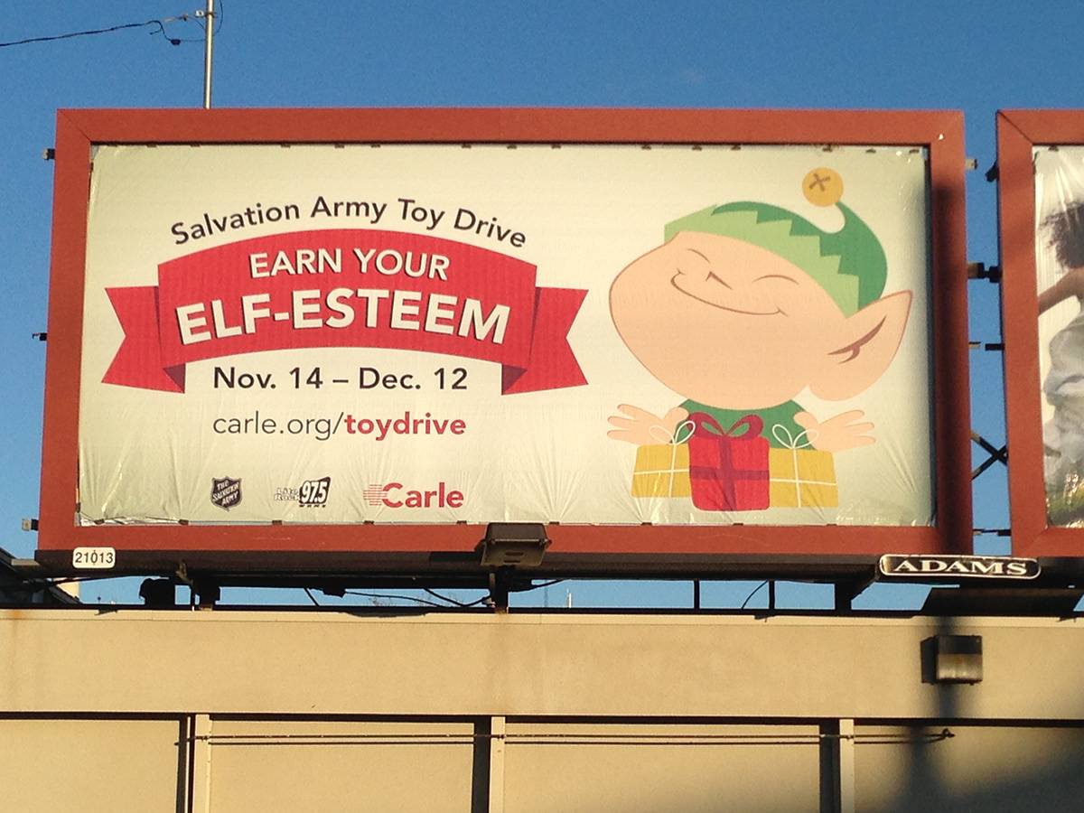
The Salvation Army Toy Drive campaign:
Or the billboard for Freedom Roofing and Construction, another one that changes from day to night:
And there’s so many more recognizable ones around town. So, shortly before the madness of the holidays, I got the chance to discuss with him some of his work, as well as his process and how these billboards have played a major part in his life (spoiler alert: he proposed via a billboard!).
Smile Politely: Catch me up on some of the lingo. I noticed on your website that there’s “designer,” “illustrator,” and “art director.” What’s the difference?
Dan Wild: Art directors typically have more experience and creative control. A career trajectory is graphic designer, senior designer, art director, and creative director. Illustrators can draw, sometimes for ads. Not all designers are illustrators; I’m one who is. I’ve been the art director at Adams Outdoor Advertising – Champaign for 2.5 years, and it’s my job to manage the art displayed on our 300 plus structures. I also partner with our clients to create original campaigns. I concept creative, write copy, take photos, illustrate, and design ads. I also create illustrations and caricatures for the other 40 plus Adams and Fairway branches in the country.
SP: How did you get into this? Did you study it in school? What (pardon the pun) drew you to it?
Wild: I was always drawing, reading and wisecracking—and kind of just being weird. I guess that was training for a career in advertising. When I was a kid, my mom was a freelance writer. She’d go into the newspaper’s pressroom at night to type articles. I’d go with and wander around the empty pressroom and pre-press area, where I’d see mock-ups of the comic pages and paste-ups of ads too. It made an impression.
In junior high, a teacher caught me drawing his unflattering caricature. He loved it and showed it around. I ended up getting permission to create portraits of few teachers, which were displayed in the school’s trophy case. That’s the closest thing to a trophy I received in junior high or high school.
In high school, I was the kid in the back of the room doodling, and art classes were the only things that held my interest. I somehow made it to college where I studied computer graphics and multimedia with a minor in animation. I worked for the school paper, drawing cartoons and writing articles, so I got an early start. Since then, I’ve had different jobs and titles, but mostly, I’ve made a career out of making cool stuff that serves a purpose and has an impact.
SP: What’s your process like?
Wild: I have a different process for caricaturing and illustration work, but I’ll tell you about outdoor campaigns—which can vary by client and deadline. When I have creative freedom and time, I brainstorm copy and concepts. I’m designing for big impact in just a few seconds, so I strive for 7 words or less. I like to create three drafts for clients. The first matches other ads they’ve done but follows the rules of outdoor: 7-10 words, a single point of contact, clear message and image. Follow these rules, and you’ll have perfectly fine, sometimes even great, billboards.
 The next level solution appeals to emotion, often with humor or surprise. Examples include a few of the 217 Inc. backlit designs in downtown Champaign—like the “Cool Days Hot Nights” execution that won an Addy last year. Another example is the “Moving to Canada?” campaign for the McDonald Group. It went viral, was copied by realtors around the nation, and in 2016 was a finalist for an OBIE—one of the oldest and most respected awards in advertising. Another favorite is the NuMed “Get THC here” campaign.
For the third option, I provide a solution I know will get attention—something counterintuitive, daring or straight-up ridiculous. Sometimes it takes advantage of the location or unusual materials. These don’t happen very often, but when they do, they are gold. Examples include the Spiros Law one-word campaign, featuring words like Justice, Respected, etc. The Prairieland Feeds 2016 and 2017 Pet Fair Extravaganza campaigns are additional examples. In the first, we teased people with 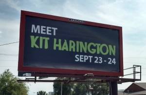 missing pet posters for alligators, horses, goats and more, and the next year’s campaign we promoted animals named after celebrities. Or, if you want to go way back, the Espresso Royale “Love Your Coffee” campaign, or the Up A Notch Records “Hip Hop Rots Your Brain” campaign, promoting a local hip-hop show. They were fun campaigns I did when I worked for Adams earlier in my career.
For illustrations and commissioned caricatures, I work with a client to understand their needs and desired style, do rough sketches, get approval, then create and modify until complete. For event caricaturing, I do either inked caricatures in 5 minutes per person, or penciled in 2.5 minutes.
SP: What have been some of your favorite projects to work on? Why?
 Wild: I mentioned my favorite outdoor campaigns above.
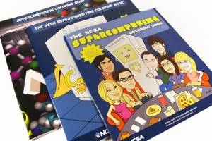
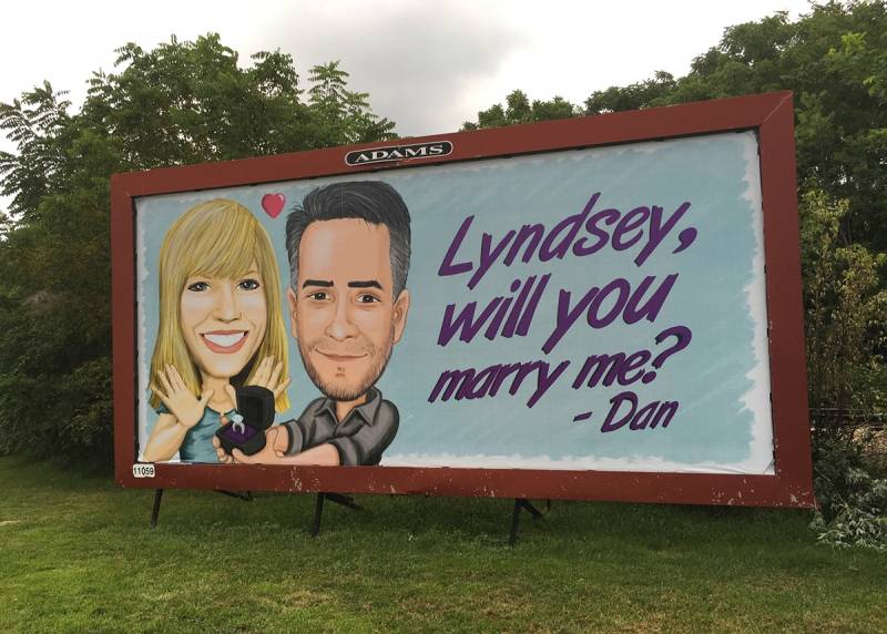
I also loved doing a caricature of the cast of The Big Bang Theory for a coloring book for NCSA at Illinois. And one of PGA golfer William McGirt for a billboard for Wade’s Southern Cooking in Spartanburg, SC. The Golf Channel aired a segment on it. Also, my proposal billboard is my best and most effective billboard—being that she said yes. There’s your proof that billboards work.
SP: You proposed via a billboard? Tell me about that.
Wild: Yeah, I did! As the art director for the local billboard company, it was inevitable. That said, it still surprised and impressed my lovely fiancée Lyndsey Groth —which was the point. Hi, Lyndsey! I love you!
SP: Most challenging projects to work on? Why?
Wild: Any project can be challenging if there’s a tight turn time and differing opinions on what’s effective.
Event caricaturing gets challenging when the music’s too loud for me to talk to people I’m drawing. Also, at every event I caricature at, somebody asks, “Can you photo bomb a caricature?” It’s not so much challenging, as it is weird, that someone makes that joke at every single event, I kid you not. That and “Draw me like one of your French girls,” the line from Titanic. If you see me at an event—please, don’t.
SP: It seems some of your more recent projects include digitally painted caricatures, including doing it at live events? Is that an area you want to move into more?
Wild: At events, I typically draw with pencil and ink, but I sometimes draw digital caricatures in Photoshop, using a Microsoft Surface Pro and projection screen. Corporate clients at tradeshows like the digital caricatures, because it is entertainment for the booth. Smaller parties like the traditional caricaturing; it’s quick, handmade, and people get a takeaway. I also create digital caricatures for personal projects and commissions, like these trading cards I made with my fiancée for her coworkers.
SP: What do you see for the future? Any goals?
Wild: I want to make more cool stuff, maybe even cooler stuff. I don’t know what yet, but that’s what’s fun about commercial art—you don’t know what you’re going to be doing next. Also, I’ve started a personal project that’s in its very early stages, which I’ll eventually start talking about on my social media. Follow me on Facebook, LinkedIn, Twitter and Instagram, if you’re interested in seeing it develop.
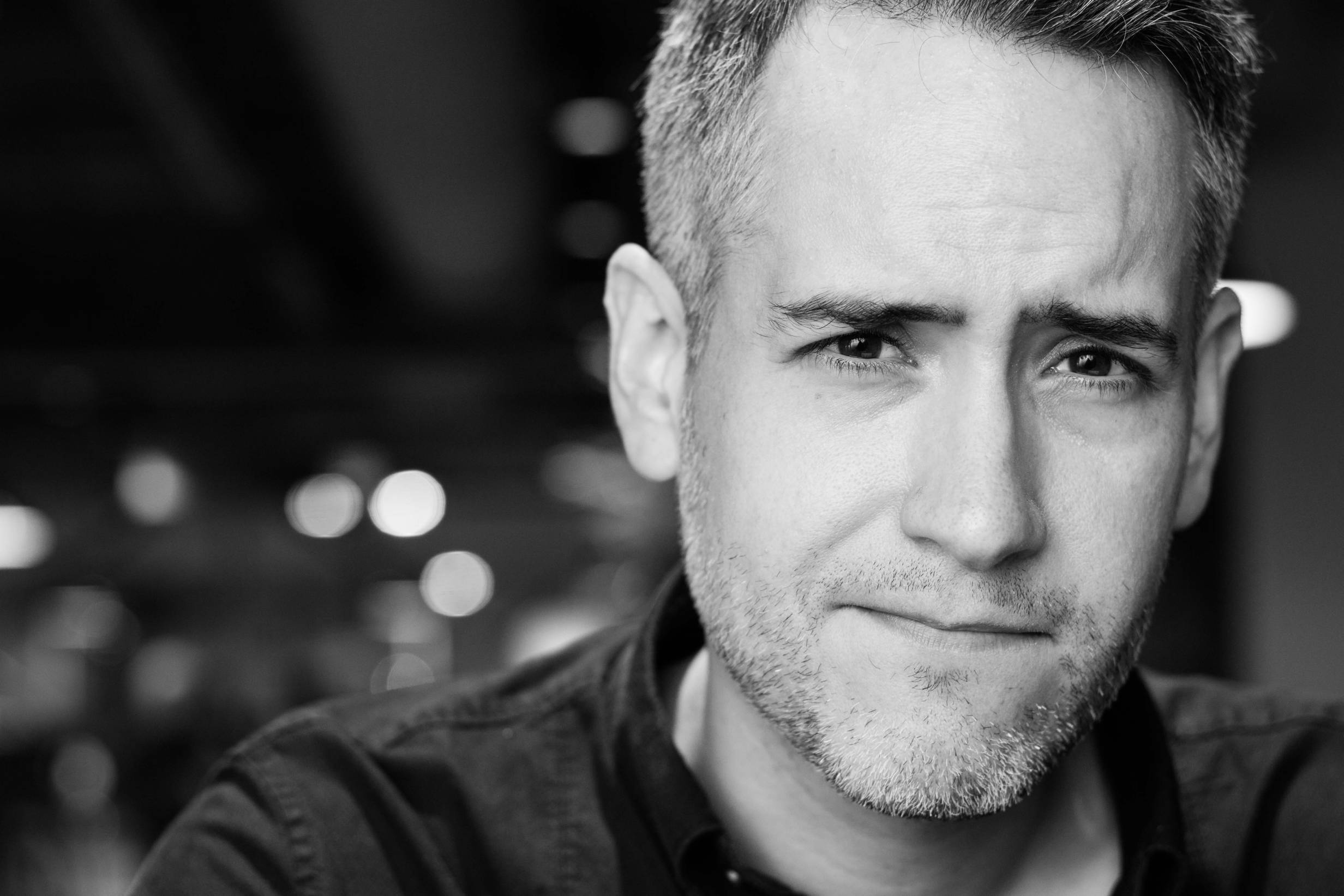
Lead portrait photo by Lyndsey Groth.
Photos within article provided by Dan Wild.


