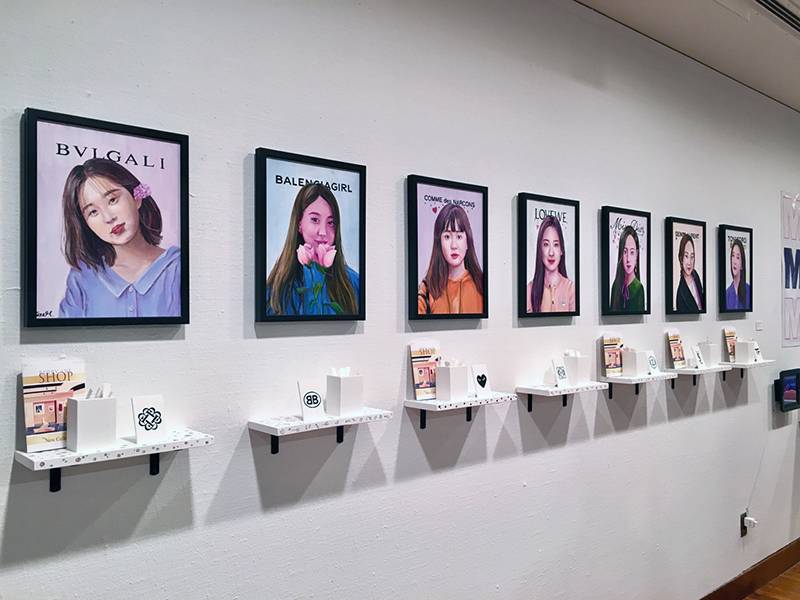
A big congratulations to the University of Illinois seniors that are graduating this spring, but more importantly, to those of the Bachelor of Fine Arts program in the School of Art + Design! This past weekend I was able to attend the opening reception of their exhibition on both levels at the Krannert Art Museum—this seems to be a place I frequent for all of my art adventures. The weather was very nice that evening, and so many nicely dressed people attended the opening reception, including my professors. It was fun trying to figure out if I should approach, greet, and then have that slightly awkward conversation with them, or if we were just going to pretend we did not know nor see each other. In case you were wondering, decided on the former.
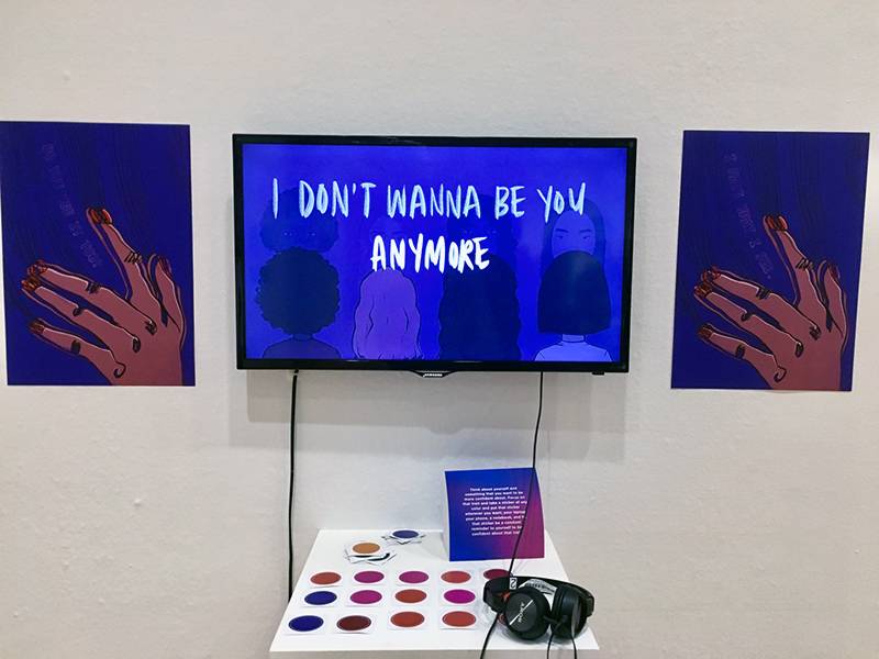
Regardless, I really enjoyed the exhibition. It was similar to the previous exhibition for the master students, however you could tell there was a difference in the maturity of the art created. By this I mean that some works were not as abstract (this is not bad because it means one will be less confused and not needing as much context) and a lot of the industrial design projects focused more on immediate problems or “bettering” something that exists, such as a loose-leaf tea packaging. Or, their project was inspired by something personal that could be extended and relatable to others, like this animation video (you have to go there yourself to see and hear what it is about).

Rija Kahn, BFA Graphic Design, I Hate What I See, 2019
To me, it seemed there were definitely a lot of projects that were more about the self-expression of the artist as they found their style and what they wanted to convey, such as this clothing line with skateboard designs and these clothes and certain aesthetic that the live models embodied from the photo way above.
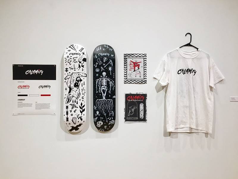
Ryan Hock, BFA Graphic Design, Calamity Skateboards, 2019
Another thing that I noticed was the large number of graphic designers and industrial designers graduating this semester. Interestingly, both of their projects were similar in how they designed programs or objects to make life easier or aid with daily routines. Many graphic designers designed really aesthetically pleasing apps, such as Oasis, by Esther Tang, and it is supposed to offer insight on how to improve one’s physical well-being through step by step guidance to build better habits. I wish it actually existed because especially as a college student, I definitely need help with maintaining my well-being. Another student created an entire music festival called Frostbite that would occur in the winter and be 100% sustainable in not creating more waste. I would have thought that graphic designers mainly just designed things, hence the name of their major/concentration, but it was really cool to see their creativity beyond just making designs, and actually creating an entire well-thought concept or idea.
Looking back, it makes sense that there were more graphic designers and industrial designers because that best fits the current market, as many ideas are becoming digitalized and we are always needing new ideas and objects to obsess over in this capitalist economy. On the other hand, there were definitely a lot less painting majors than I had thought there were, but I greatly appreciated the few pieces that they created. (This is where I go on a tangent about some paintings like a painting major would).
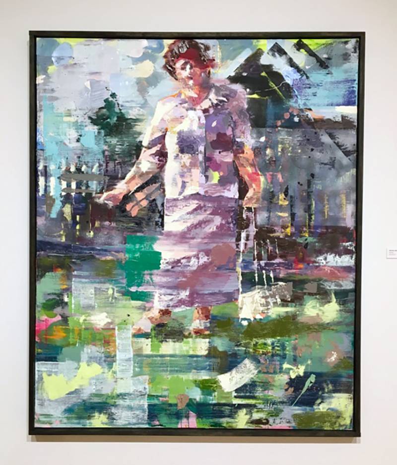
Monika Monko, BFA Painting, Wysockiego 52, 2019
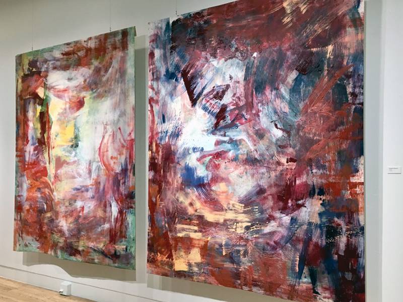
Sebastien Johnson, BFA Painting, Unnamed, 2019
In the one on the top, I really appreciated all of the layering and all of the visible changes that were made throughout the making of the piece. There is also so much going on with the colors, patterns, and brushstrokes used. Some parts of the painting have marks that partially cover each other or smear certain areas, but the placement of those marks still allow for me to make sense of the figure and their surroundings. Almost the same could be said for the paintings below, which are actually painted on a material and hung from the ceiling. I had to go very close to the paintings to figure that out, as well as simultaneously observing the thickness of some chunks of paint that were applied. There was also a lot of mark-making with larger brushes that may or may not have had meaning—only the artist knows this and how it came to be.
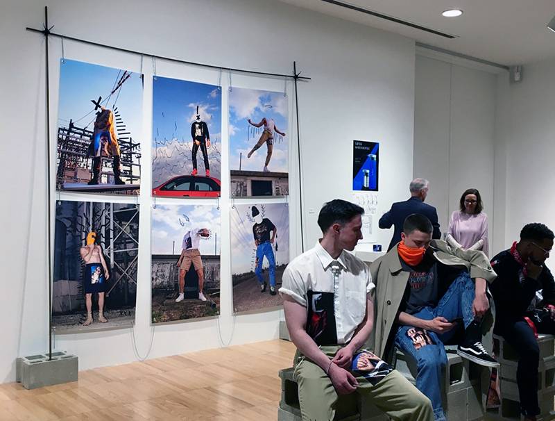
Konrad Wiring, BFA Photography, Kone Ranger, 2019
All in all, it was another great experience and exposure to different mediums and what you can do with different concentrations in the fields of art. The artwork was spectacular, and if you had not known that it was a Bachelor of Fine Arts Exhibition, some of the work could have you thinking they were done by a professional. For me, it was very inspiring but also created a new panic in regard to what I should create as my own final project in three years. Though hopefully when you go, it will only induce inspiration and not panic. Be sure to visit this exhibition soon, because it is only up until May 12th!
2019 School of Art + Design Bachelor of Fine Arts Exhibition
Through May 12th
Krannert Art Museum
500 East Peabody Drive
Main Level, East Gallery and Lower Level, Hood Classroom
Top photo © Soyoung Chong, painting student, It Isn’t Extravagance, 2019. All photos by Tianyuan Wu


